HAZEL

Rediscover your roots

Hazel is a property directory for older people, many of whom have retired, that aims to take the stress out of the logistics of moving. Whether they are looking to downsize, leave the city, or be nearer grandchildren, Hazel’s carefully considered filter allows users to find the most suitable home for them. Their specialist advisors also help with negotiations, packing, and moving to create a seamless experience.

Image of a bunch of flowers in a vase on a kitchen table
Gif of the three different versions of the Hazel logo, the first consists of a house/leaf icon and 'hazel' written underneath. The second has the house to the left handside of the text, the final one consists of just 'hazel' on its own
Gif of three different slides, all have the strapline 'Rediscover your roots' on the left, with changing imagery to the right hand. Each slide is a different colour combination

The name Hazel, of a Hazel tree, was born out of the concepts of growth and putting down roots, reflecting the idea of a new lease on life. The logo blends the shape of a house with tree branches that echo the idea of paths to be taken and the opportunities that moving can bring. The brand colours take inspiration from hazel trees throughout the seasons, also reflecting the different stages in the user’s own life.

Four different pages from the Hazel brand guidelines, the first shows the different variations of the logo, the second shows the logotype and icon in use on websites and mobile, the third shows the colour palette, the fourth shows how the typeface
A website mockup showing a list of search criteria when using Hazel, the list is titled 'Find the perfect home for the next stage of your life.' On the right there are two images of a property with information including price surrounding them
Gif that cycles through all of the Hazel brand colour combinations, with the leaf/house icon in the centre
Orange type on a brown background that reads 'Search. Choose. Grow.' The Hazel logo sits beneath in the bottom left corner.
A tile of squares showing different UI elements for the Hazel website, some examples include radio buttons for local activities, icons and illustrations
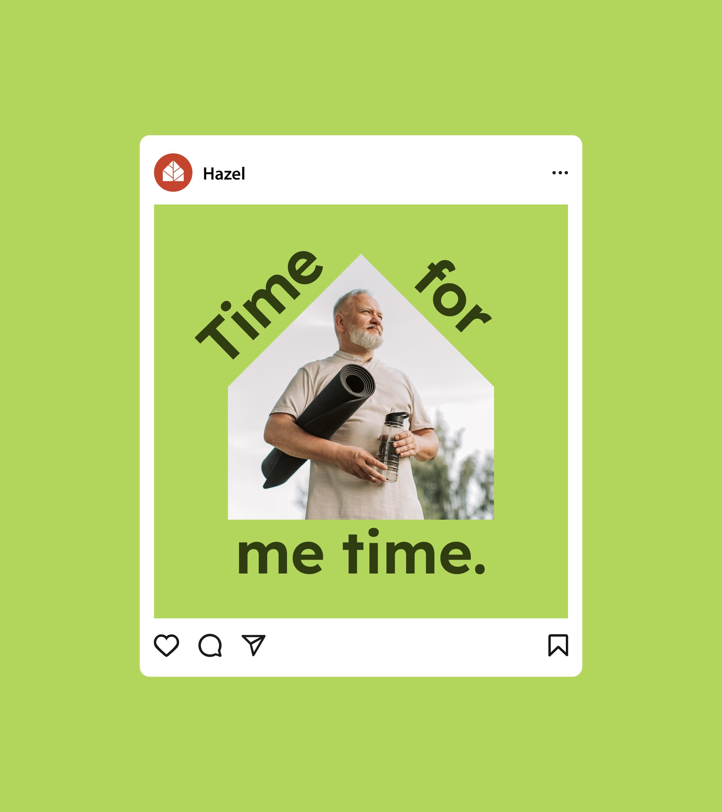
A Hazel instagram post that sits on a green background, the post has an image of a man holding a yoga mat, with the text 'Time for me time' surrounding it
A collection of tiled Hazel instagram posts, some consist of full bleed images with the house graphic laid over the top, others have a statement like 'Search, choose, grow' over the top of the leaf pattern on a coloured background.
A billboard mockup of different Hazel posters, one consists of a smiling pair of grandparents and their granddaughter, with the Hazel logo in the centre, another has an image of an old couple, with 'Search, choose, grow' surrounding it.
Light green type on a dark green background that reads 'Find your perfect patch.' The Hazel logo sits beneath in the bottom left corner.
Close up image of a pair of hands wrapping up a piece of furniture in bubble wrap and tape
Image mockup of a welcome card sitting in a wooden tray that reads 'You've sown the seeds. Now sit back and watch your future grow.'
Floorplan of an apartment, with details about the property with the Hazel logo in the bottom left. The floorplan is placed on a red background.

See more of our work

Museum of Immigration in Portugal

Celebrating immigrants and their impact

Giraffa Racing

A syndicate for the epicurean

Togather

Turning your ideas into unforgettable events

Next
Next

Togather