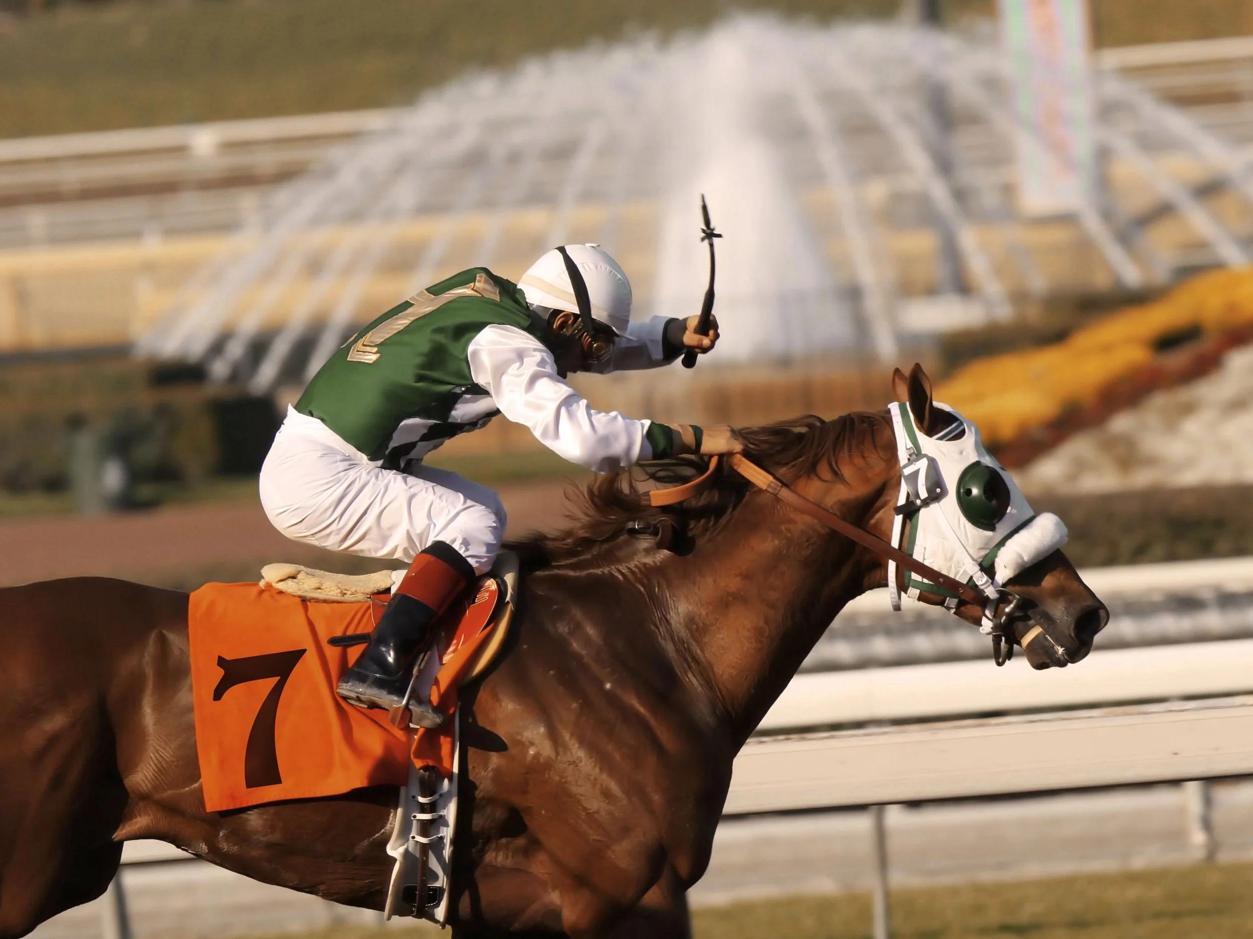
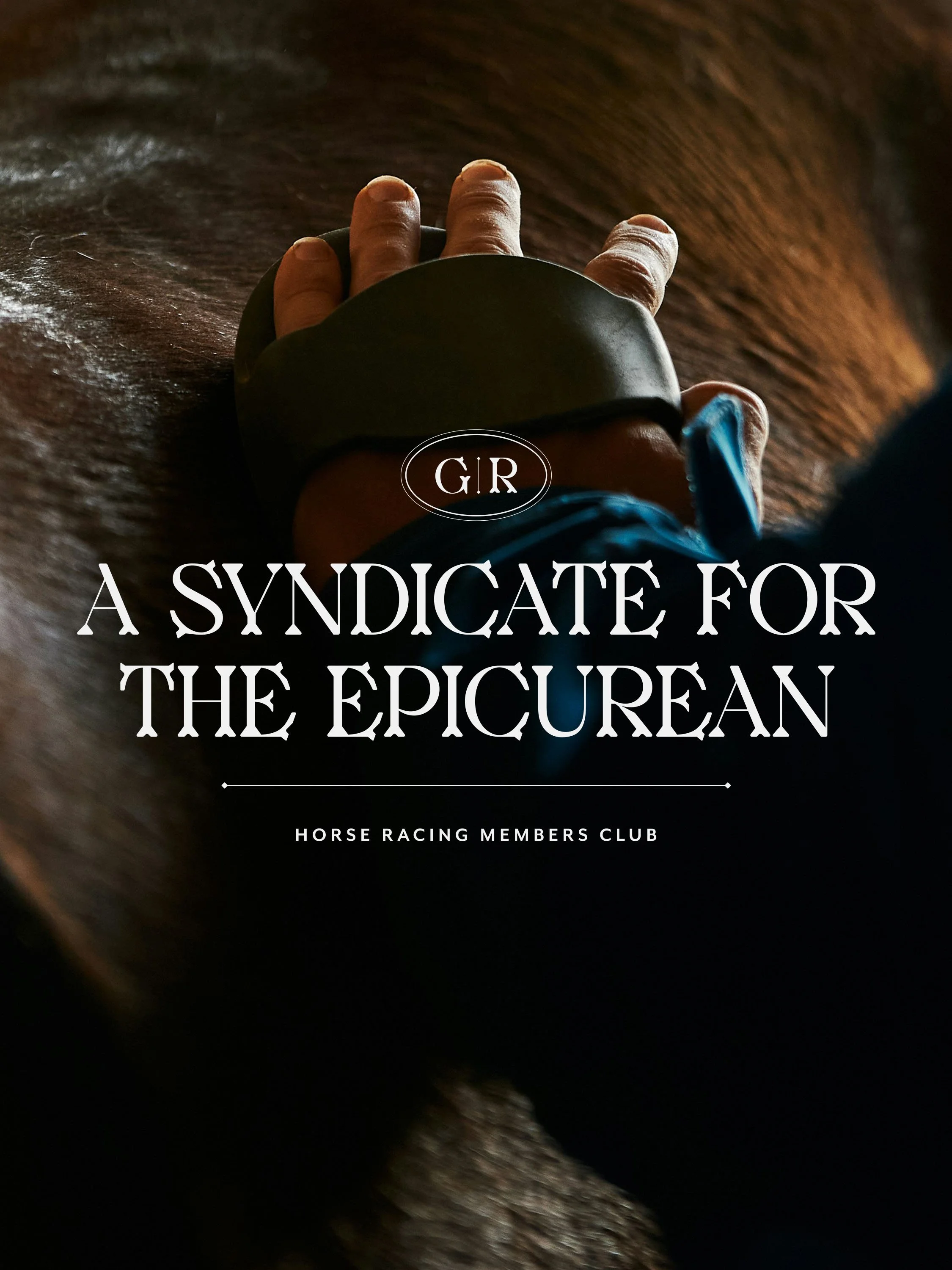
GIRAFFA RACING

A syndicate for the epicurean

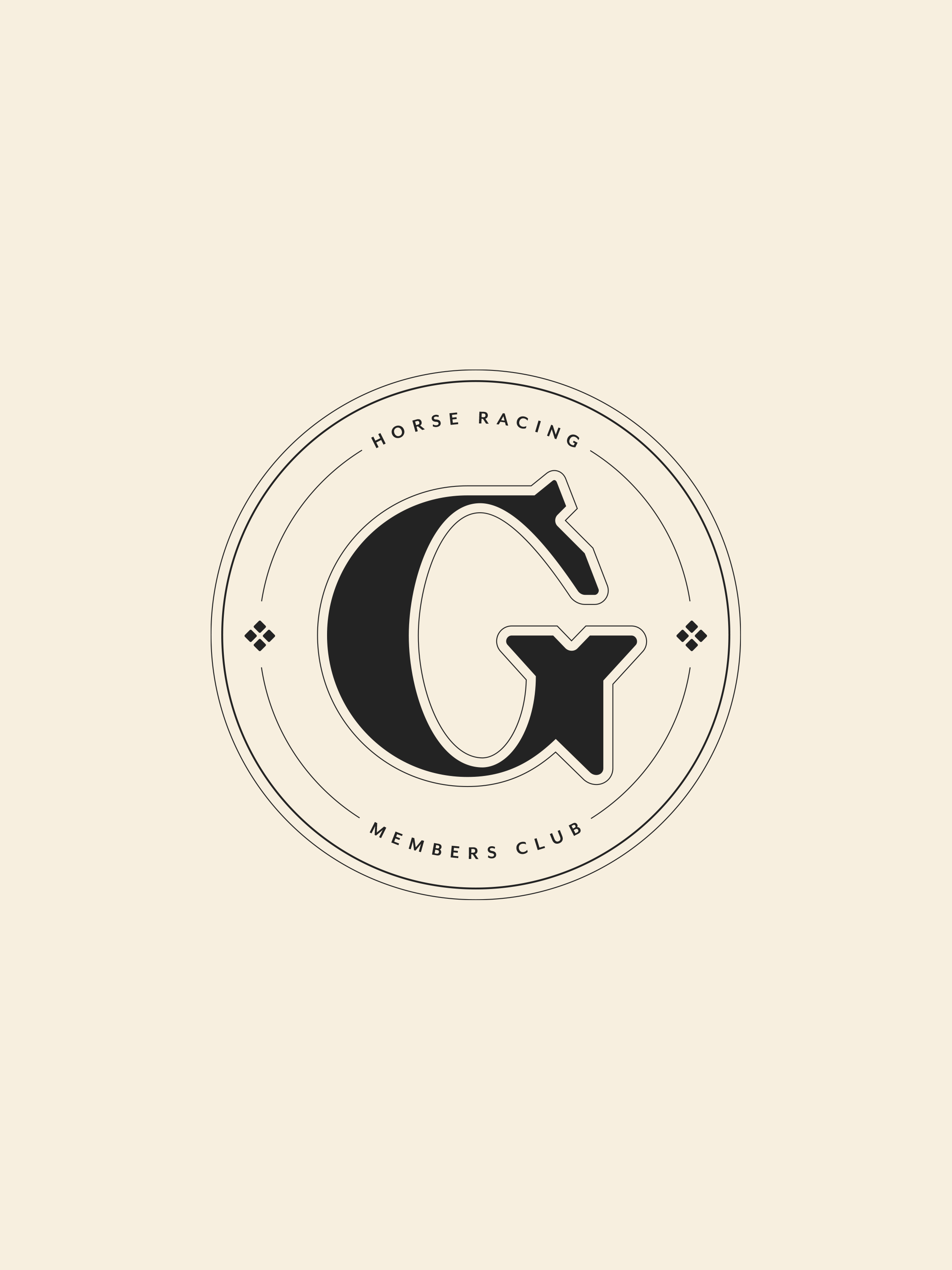
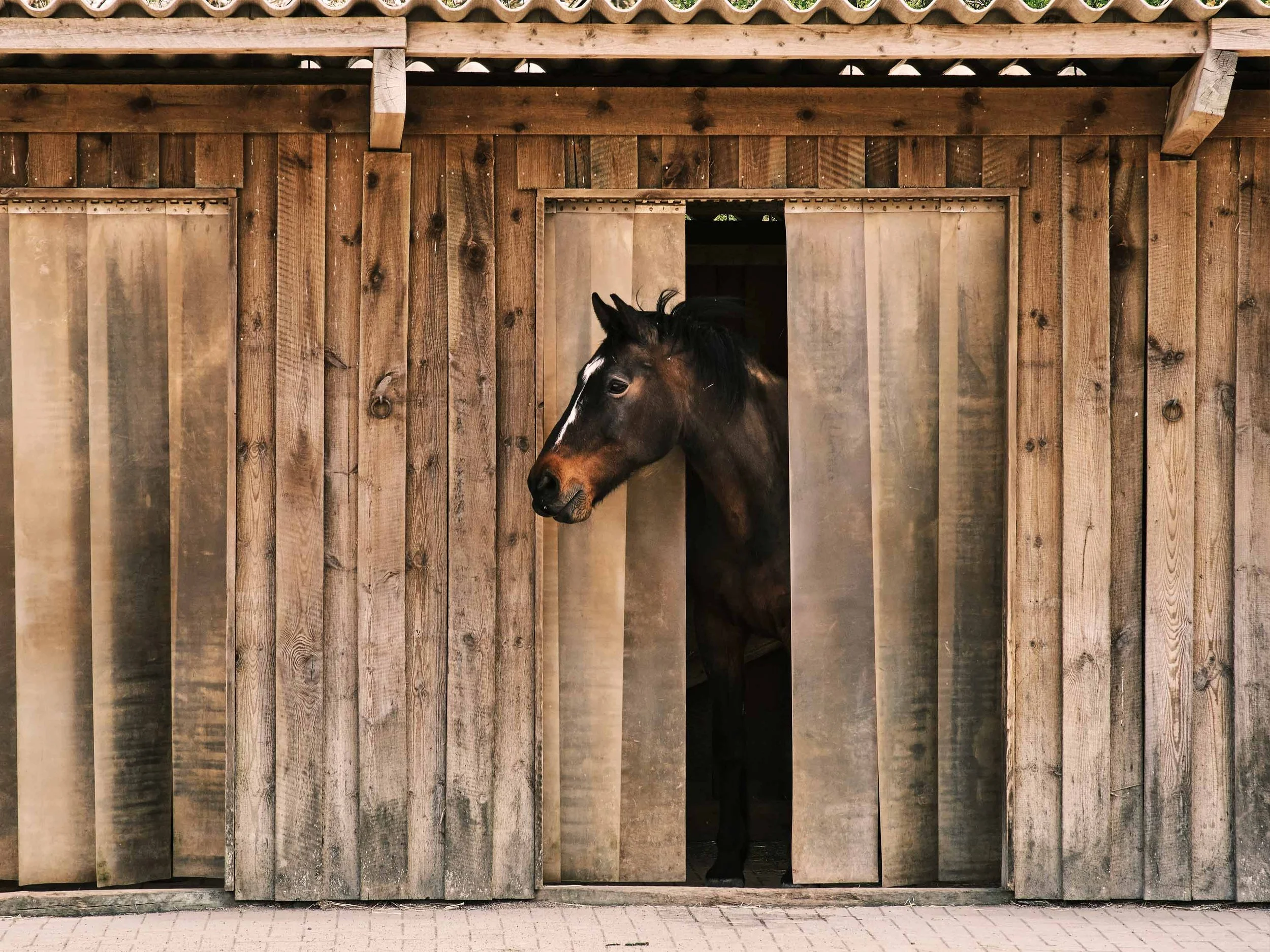
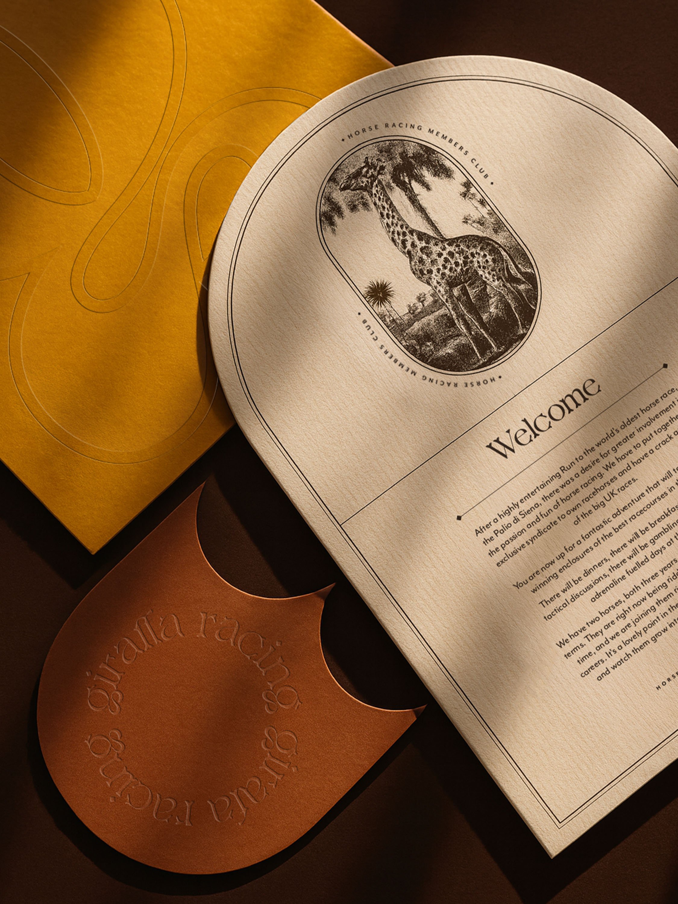
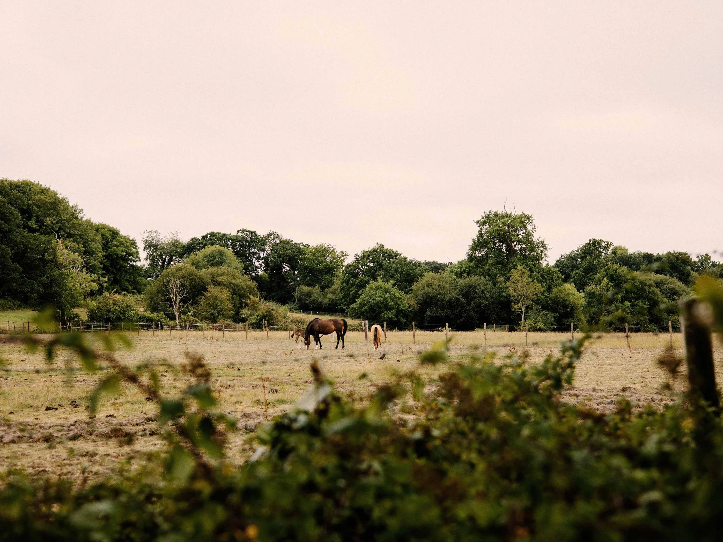
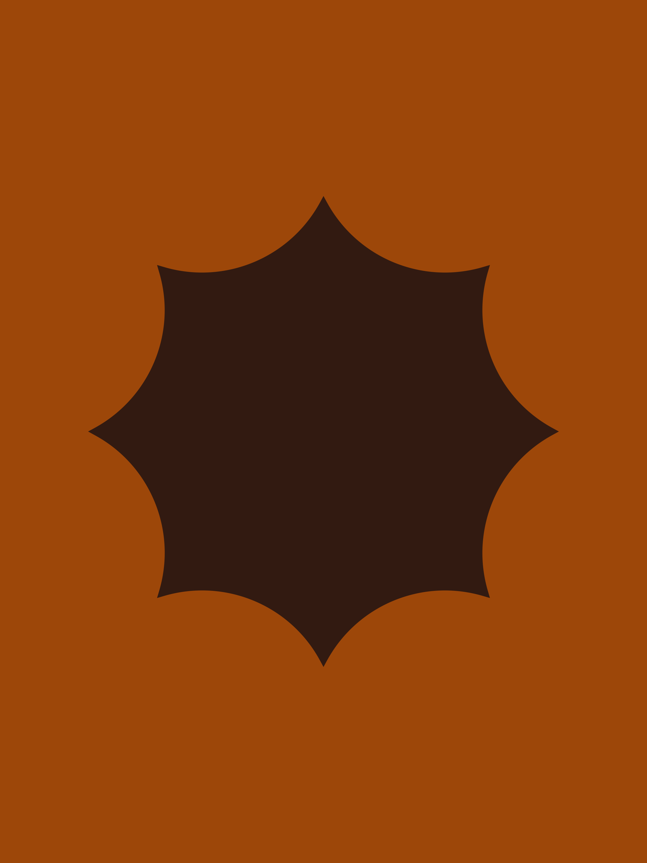
Giraffa Racing took a childhood fantasy, elevated it and rolled it in luxury. Because who didn’t dream of having their own horse? Not wanting to create an obviously equestrian brand, because although membership meant part ownership of a racehorse, it was also a luxury event and lifestyle brand, we kept the colour palette bold yet muted, with structural elements that took inspiration from the heritage of horse racing. The typeface takes lead from the name ‘giraffa’, as you can see a giraffe in the serif itself.

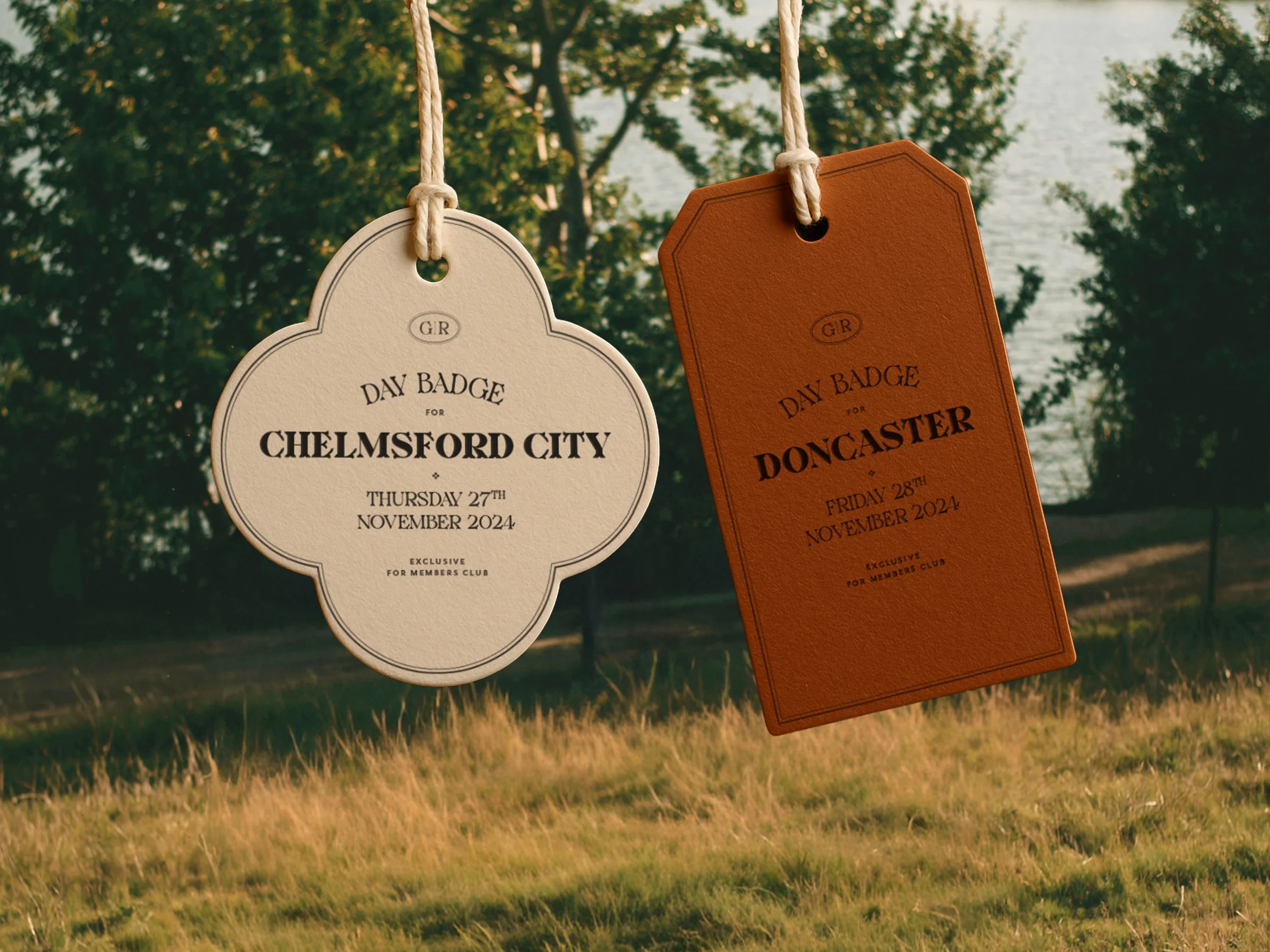
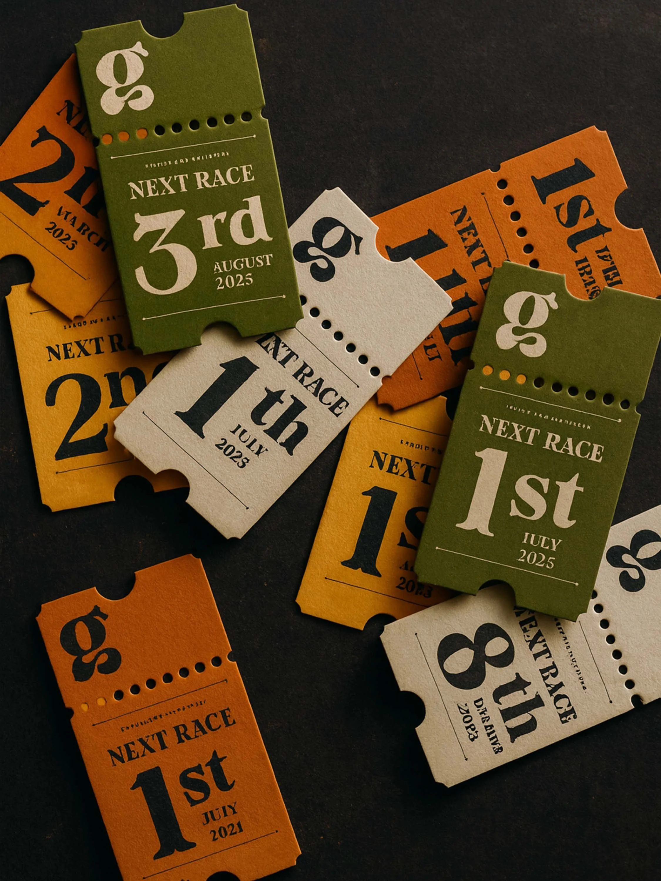
The printed materials created resemble real horse racing tag badges, cut out in their unique shapes.

Our output included…
Visual identity
Print materials

Video flicking all the Giraffa racing logo marks
Image of a beautiful stable with warm lighting and stone arched architecture
Image of a horse in the stables
A collection of an invite and other stationery cards, with embossed finishes and illustrative emblems. Colours are warm ochres, dark oranges and deep browns
An image of a green meadow with horses relaxing
An image of the logotype in white on top of an image of a close-up collection of wine glasses
A gid showing all the giraffa racing shapes and elements. These come from the shaped tickets you get at horse races, cut out in diamond and star shapes. Colours are ochres, dark greens and oranges and browns
Image of badges cut out in different shapes
A collection of tickets from Giraffa racing

See more of our work

Sea&I

Aureum

The Run To

Previous
Previous

Home

Next
Next

Pivot