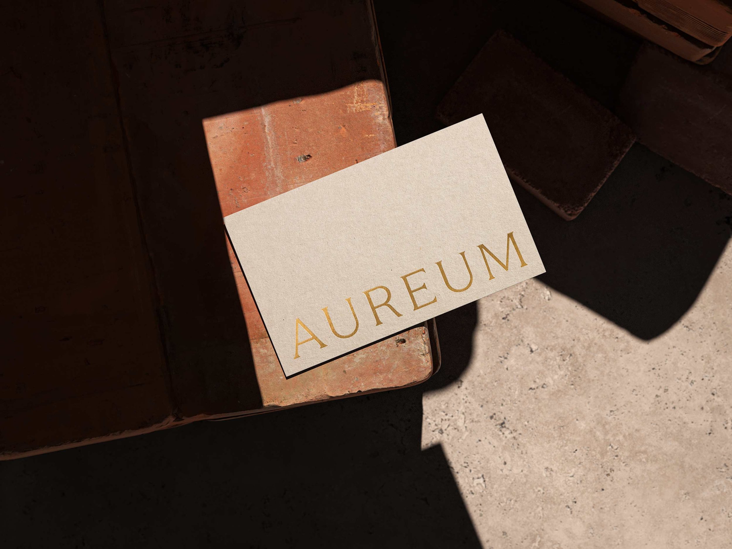
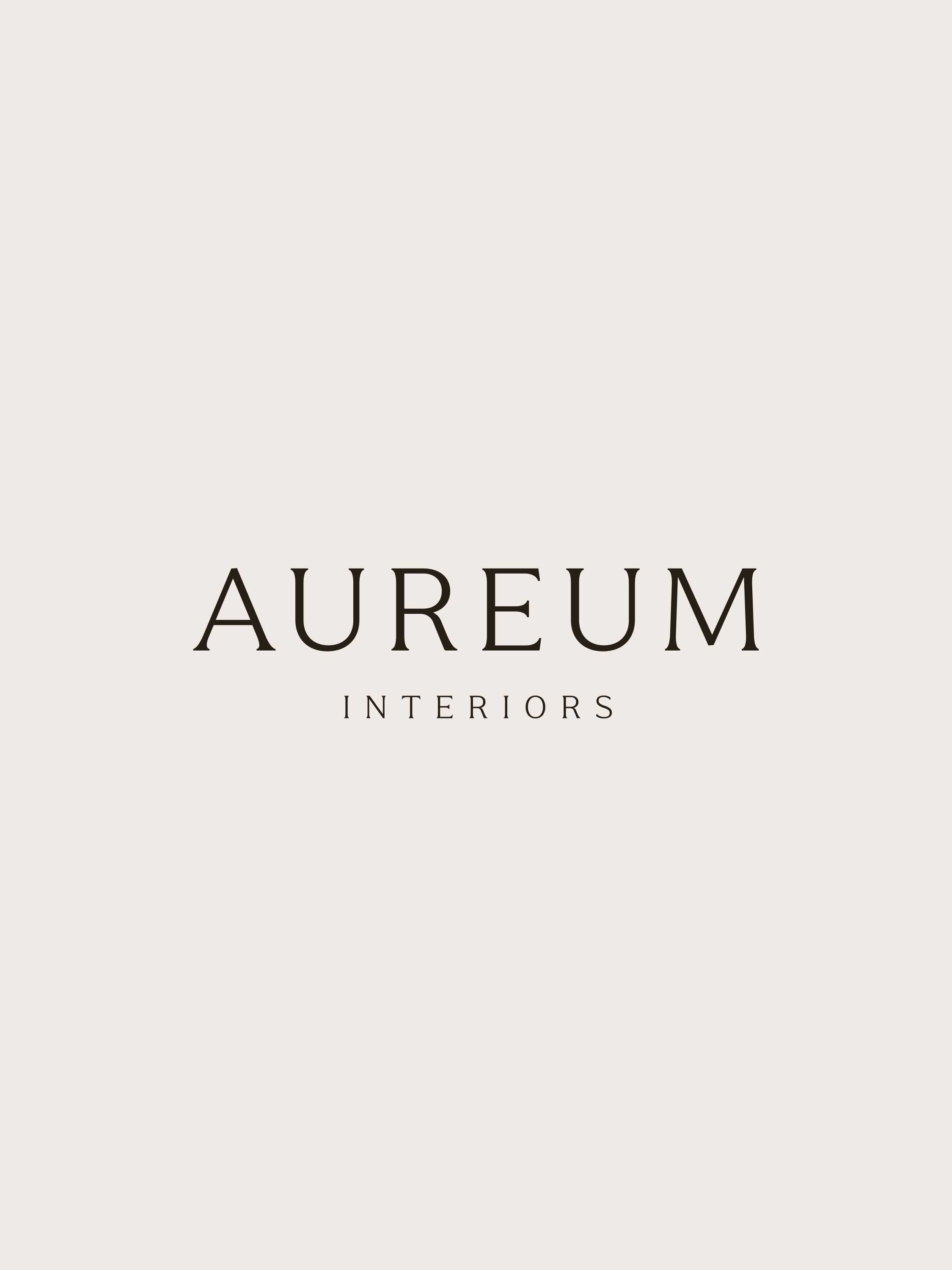
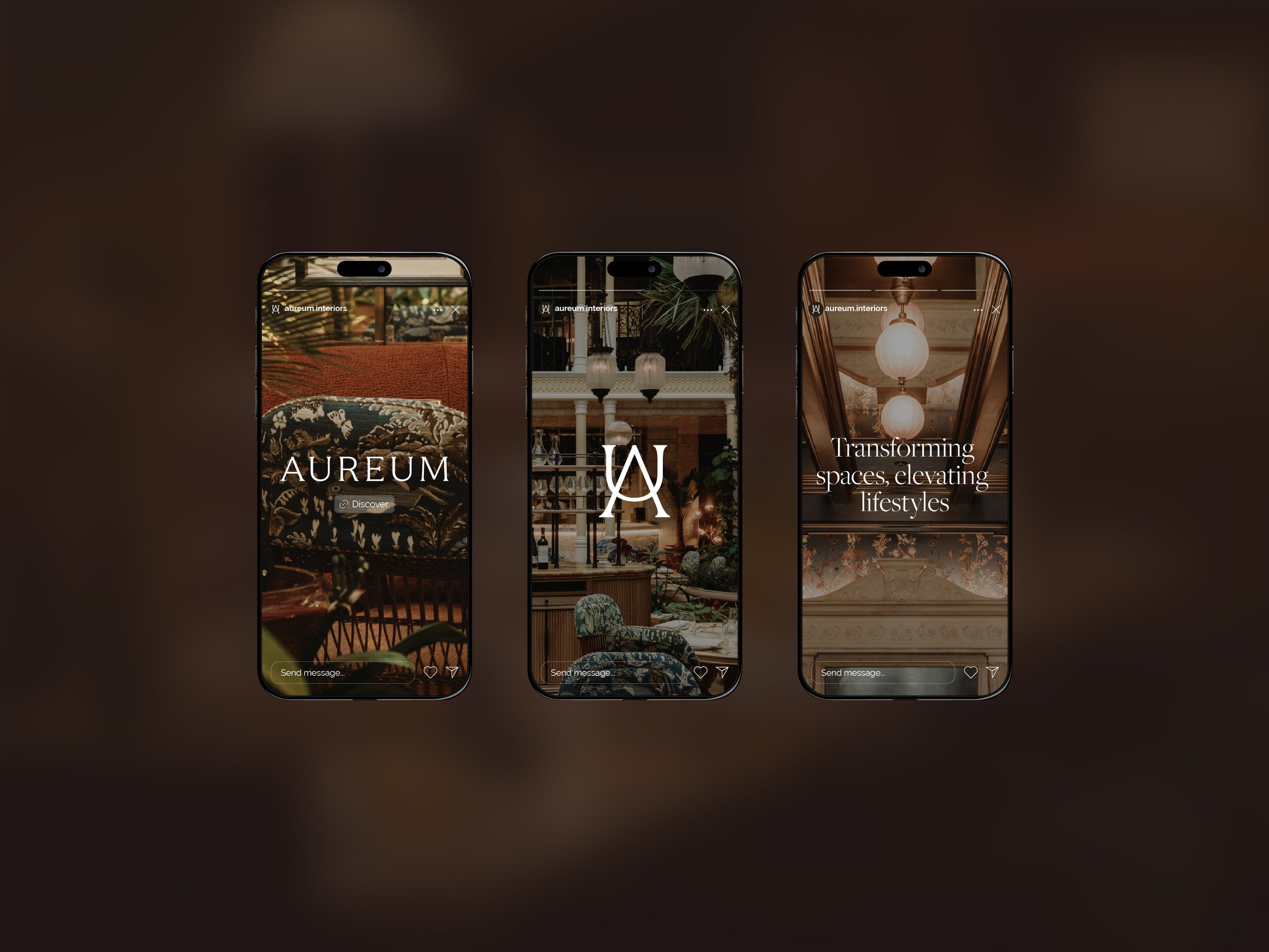
AUREUM

Transforming spaces,
elevating lifestyles

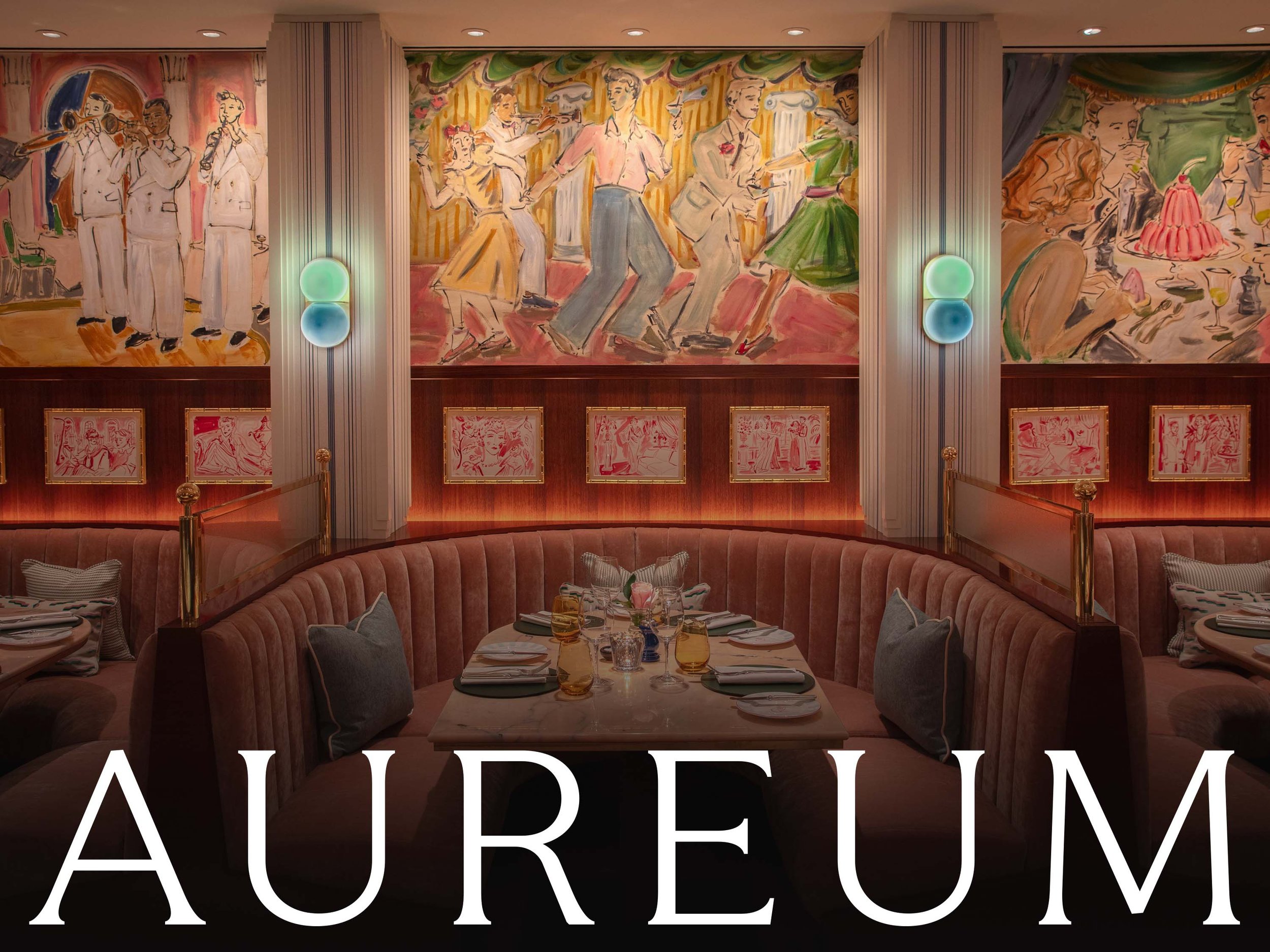
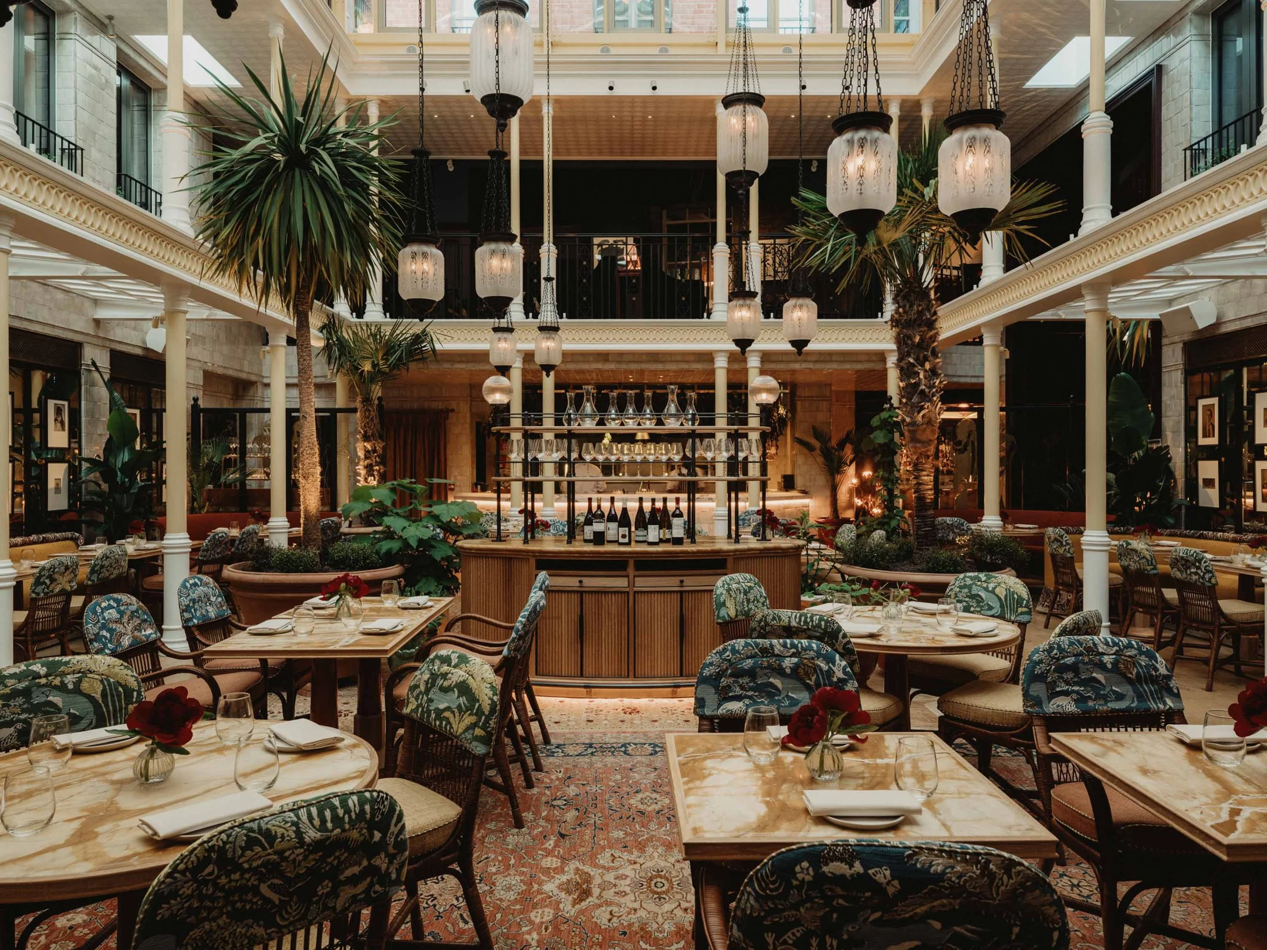
Aureum is a bespoke, full service interior design company for luxury hotels and spaces.

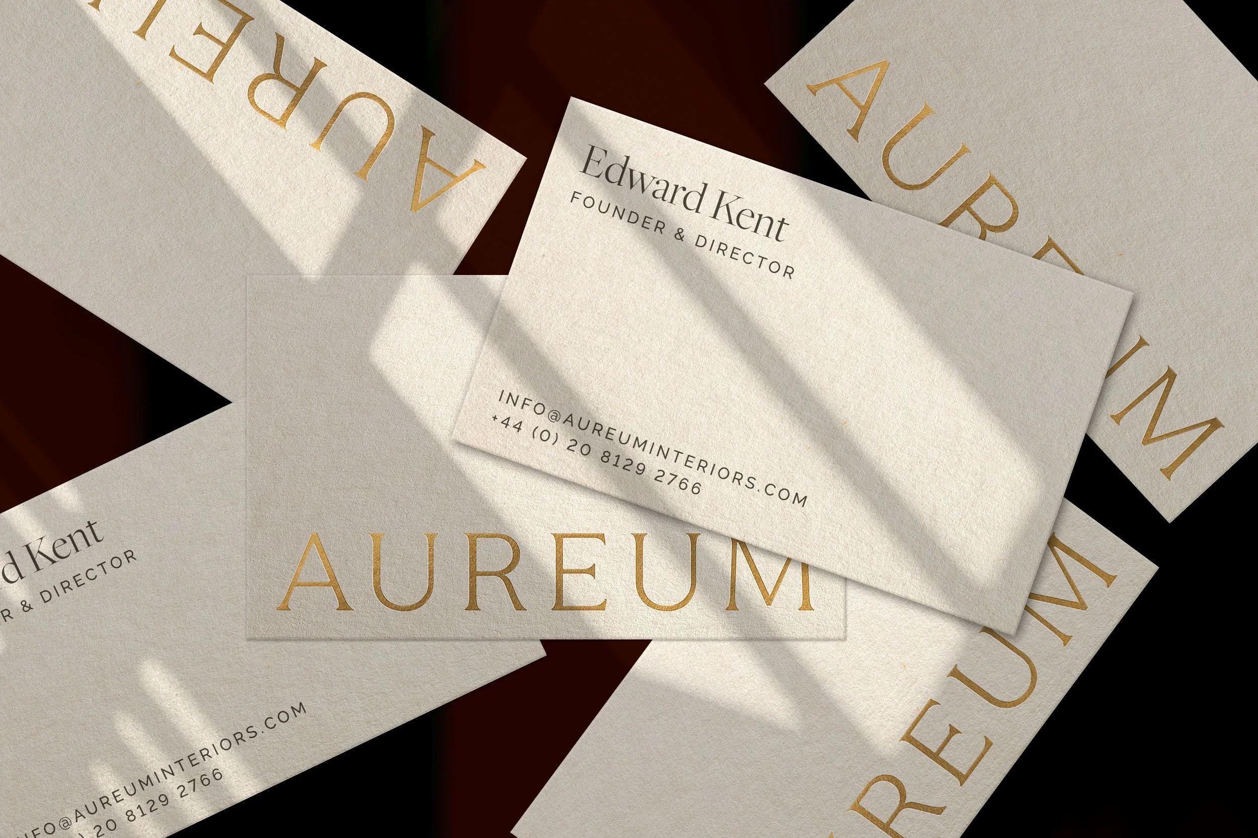
To consolidate their position in the market and ensure clients understood their ethos and design practices, they required a brand that reflected their level of experience, style and vision. Aureum is the Latin word for gold; taking inspiration from this to define the look and feel of the brand, we created a mark using the Au—the symbol for gold on the periodic table of elements. This, and the full logo mark use an elegant serif typeface to convey a sense of establishment. We rounded the identity out with earthy tones that exude warmth and luxury.

Our output included…
Brand strategy
Naming
Visual identity
Web design
Print materials

Image of the Rosi Restaurant. At the bottom, the Aureum Interiors logo
Photograph of hotel lobby with two chairs through a window
The Aureum Interiors logotype in colour black on grey background
Image of the Nomad restaurant in green, cream and brown tones
Aureum branding report with large logotype
Photograph of a hotel restaurant from above focusing on the light fixtures
Aureum branding monogram with green chair in background
A collection of phones showing Aureum's social media. All phones have a beautiful interior image and showcases the Aureum logotype, the monogram and a message: "Transforming spaces, elevating lifestyles'.
Image of scattered Aureum business cards. The logo is foiled in gold
Aureum letterhead on yellow background
Two yellow chairs facing a table laid with teacups and champagne flutes

See more of our work

Sea&I

James Eadie

The Run To

Previous
Previous

James Eadie Regional Collection

Next
Next

Voyages of Discovery