JAMES EADIE

Regional collection

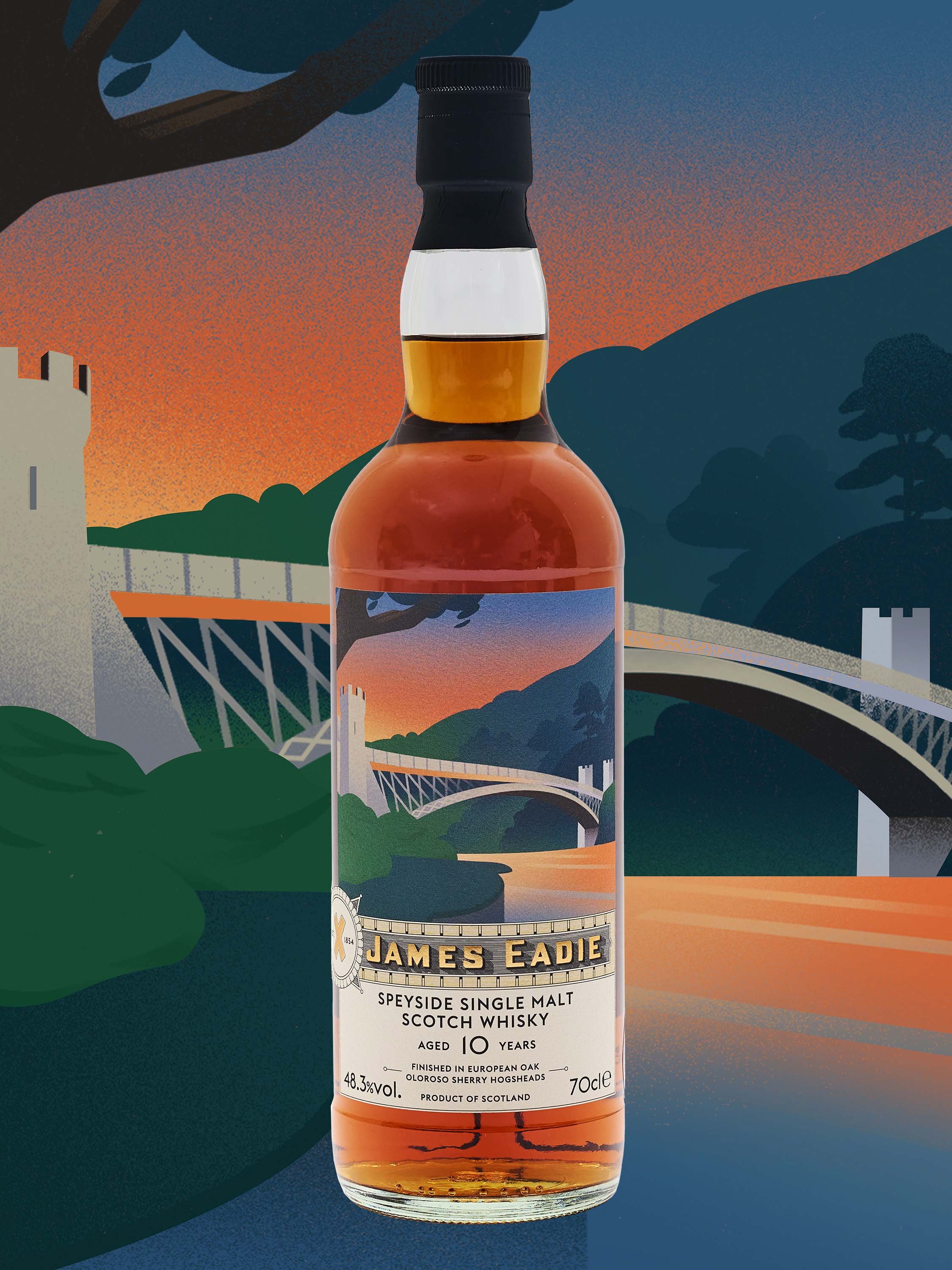
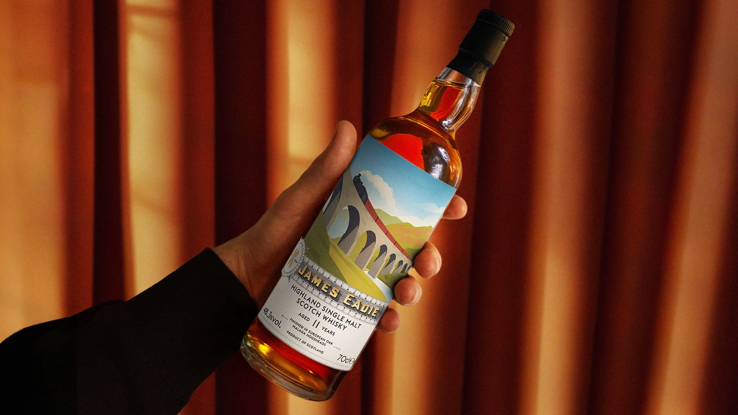
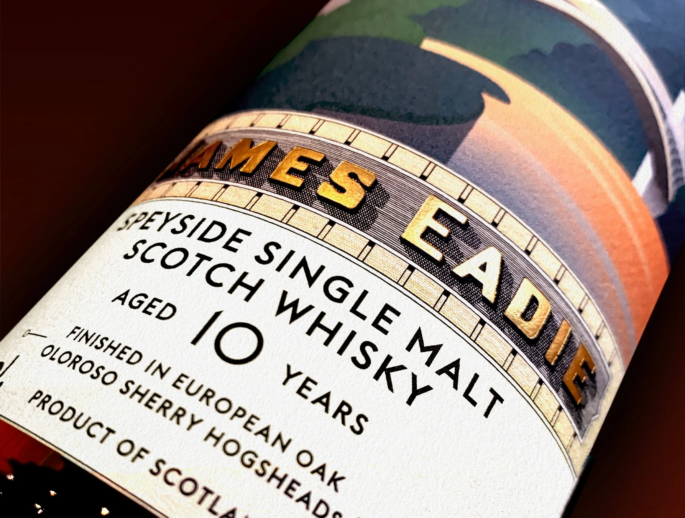
For James Eadie’s latest regional collection release we created new labels inspired by an original company letterhead from 1919. We traced the details and lettering to replicate it as accurately as possible, and digitally adjusted the spacing. We updated the X mark and added metallic gold to reflect the new brand.

The illustrations were drawn by Cristina Buonanno.

Our output included…
Packaging design

Close up of James Eadie bottle label featuring logotype and product information
Display of the Highland bottle, cut out in the centre. The background shows the illustration related to the bottle. it is a bridge with a train crossing it, a river and some mountains. Tones are light blue, yellows, light greens and dark red details
Display of the Speyside bottle, cut out in the centre. The background shows the illustration related to the bottle. it is a bridge, a river and some mountains. Tones are reds, oranges, dark greens and blues
A hand holding the Highland bottle. The background is an orange thick curtain
Close up of James Eadie Bottle cap with branding details
Close up detail image of the Speyside bottle, focusing on the typography and the gold foil element of the label

See more of our work

James Eadie Single Malt

Aureum

Trade Mark X

Previous
Previous

Gentlemen's Club

Next
Next

Aureum