
BALTIC YACHTS
Custom branding for a custom brand
Baltic Yachts is the world’s most innovative custom superyacht builder. Based in the small town of Jakobstad on the west coast of Finland, they are a proud but humble company with boat building in their blood. We visited them three times over the course of the project to see firsthand how such luxury superyachts are crafted, to understand the dedication and passion driving their work, and to become a part of the genuine warmth of the company.
Our output included…
Brand strategy
Workshops & interviews
Brand identity
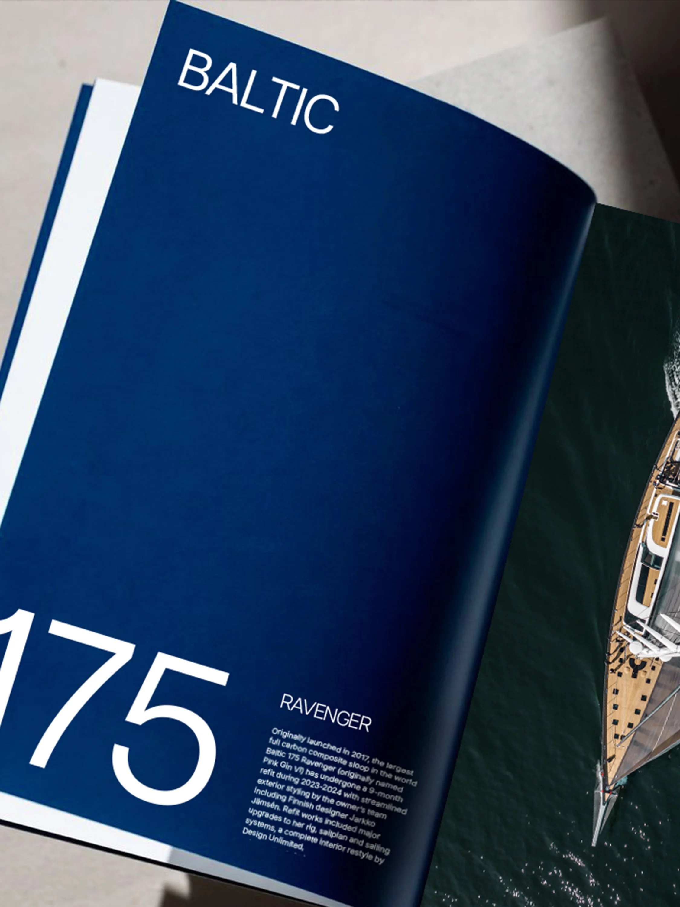
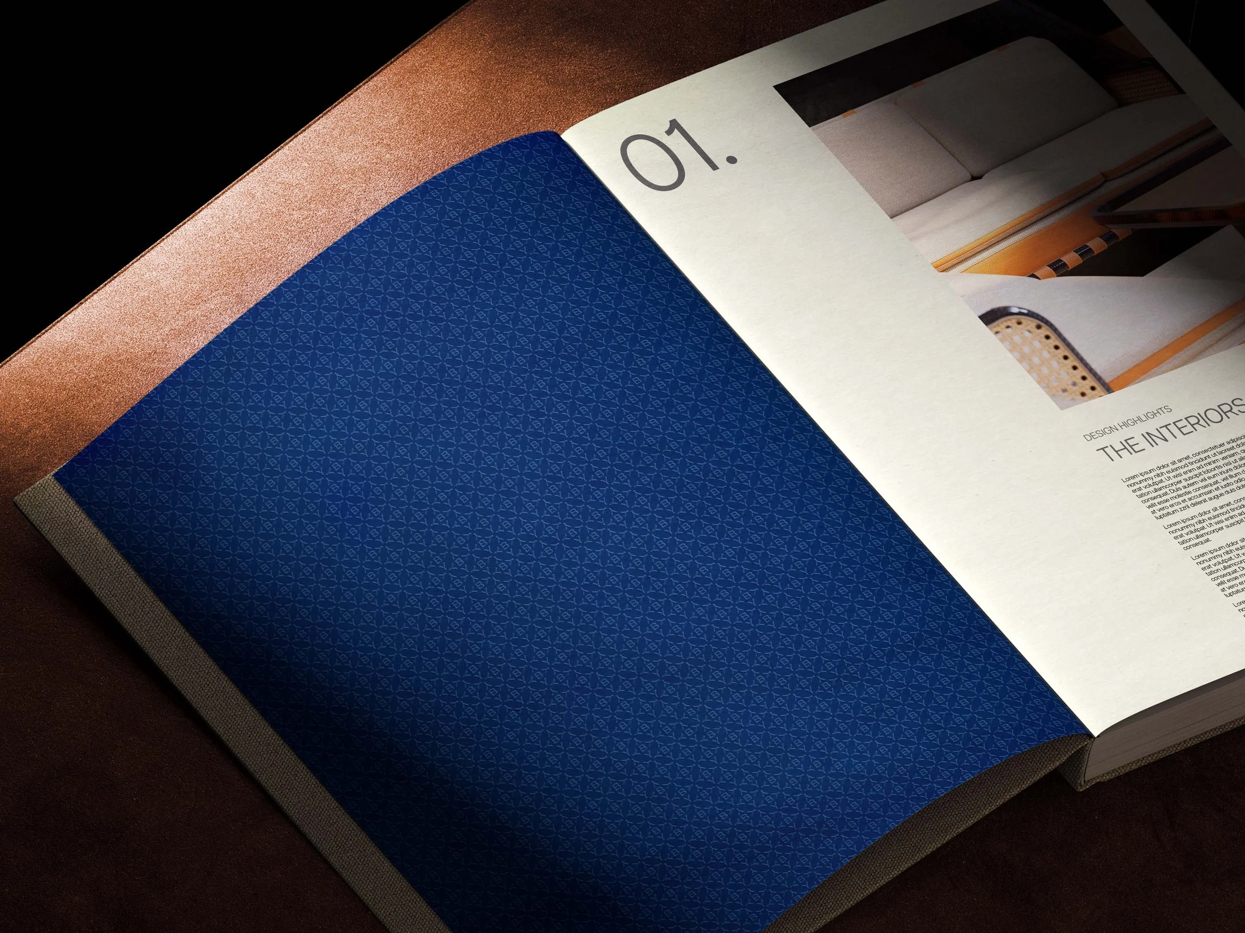
Print design
Web design

GATHERING INSIGHTS
Ahead of our first visit, we sent questionnaires to all employees to garner their feelings about the company, their history, proudest moments, thoughts on the future, and how they thought both clients and others in the industry perceived them. This qualitative data would form the basis of our two full days of workshops to revitalise their brand strategy. Armed with exercises like ‘Swipe Right’, ‘Alien Invasion’, and ‘Maker’s Mark’, we explored their values, personality, mission, vision, purpose, positioning and their SWOT. We also used the visit to have additional one-on-one interviews with employees whose questionnaire answers we found especially intriguing. The lively debate and wealth of insight, coupled with our own desk research, lead to a robust brand strategy that sparked a genuine excitement across the yard. We also spoke with a number of their clients which helped us to create personas and, subsequently, customer journeys which we explored in another set of workshops with teams from different departments and phases across the entire journey. To round off the brand strategy, we updated their tone of voice and messaging framework to reflect their newly established personality and priorities.
THE VISUAL IDENTITY
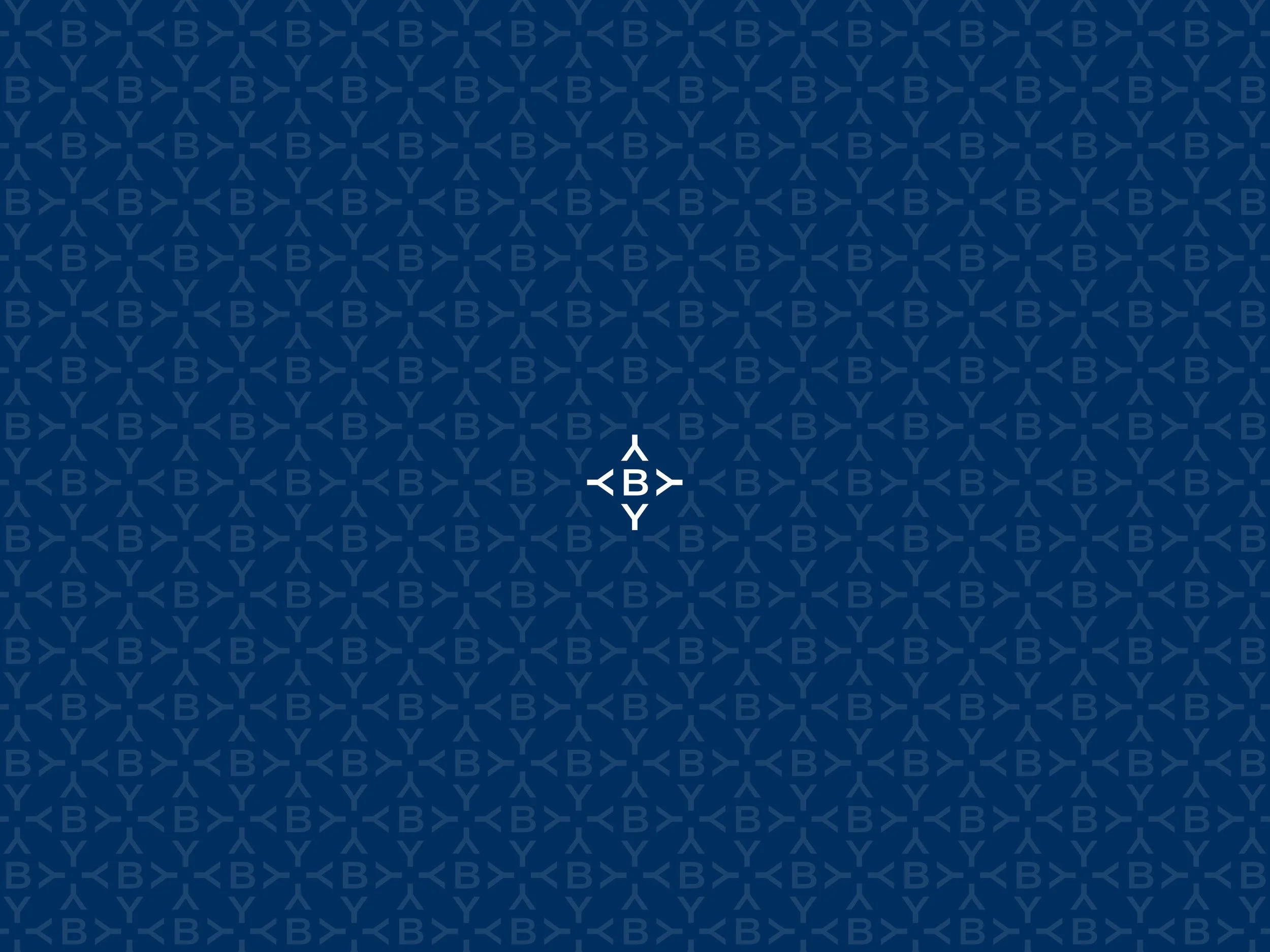
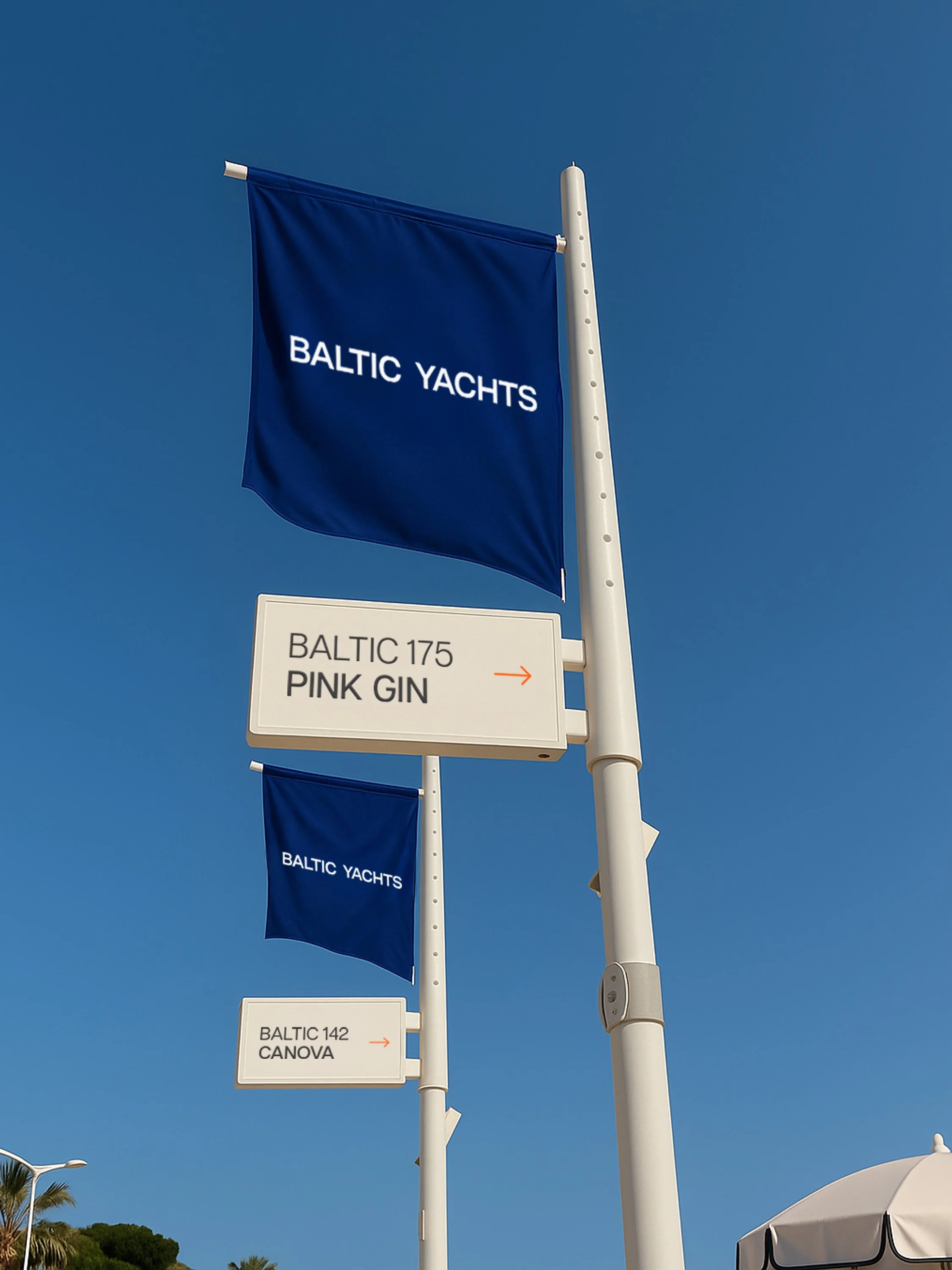
The juxtaposition of Baltic’s innovative and boundary pushing products and processes with their respect for tradition and heritage created some tension when it came to refreshing their visual identity. The emotional attachment to their existing logo, even though they knew it was no longer serving them, eventually gave way when we showed them what they could be. The new brand is elegant, modern, confident, and a much more accurate representation of who they are and the clients and partners they attract.

We retained as much of the overall feel of the colour palette as we could but updated them in line with the direction of the refresh to be both bolder and calmer, making a real statement. Typefaces were tweaked to be more intentional without veering too far away from the original, and we set specific rules for typesetting that continued to reflect the elegance of the products.


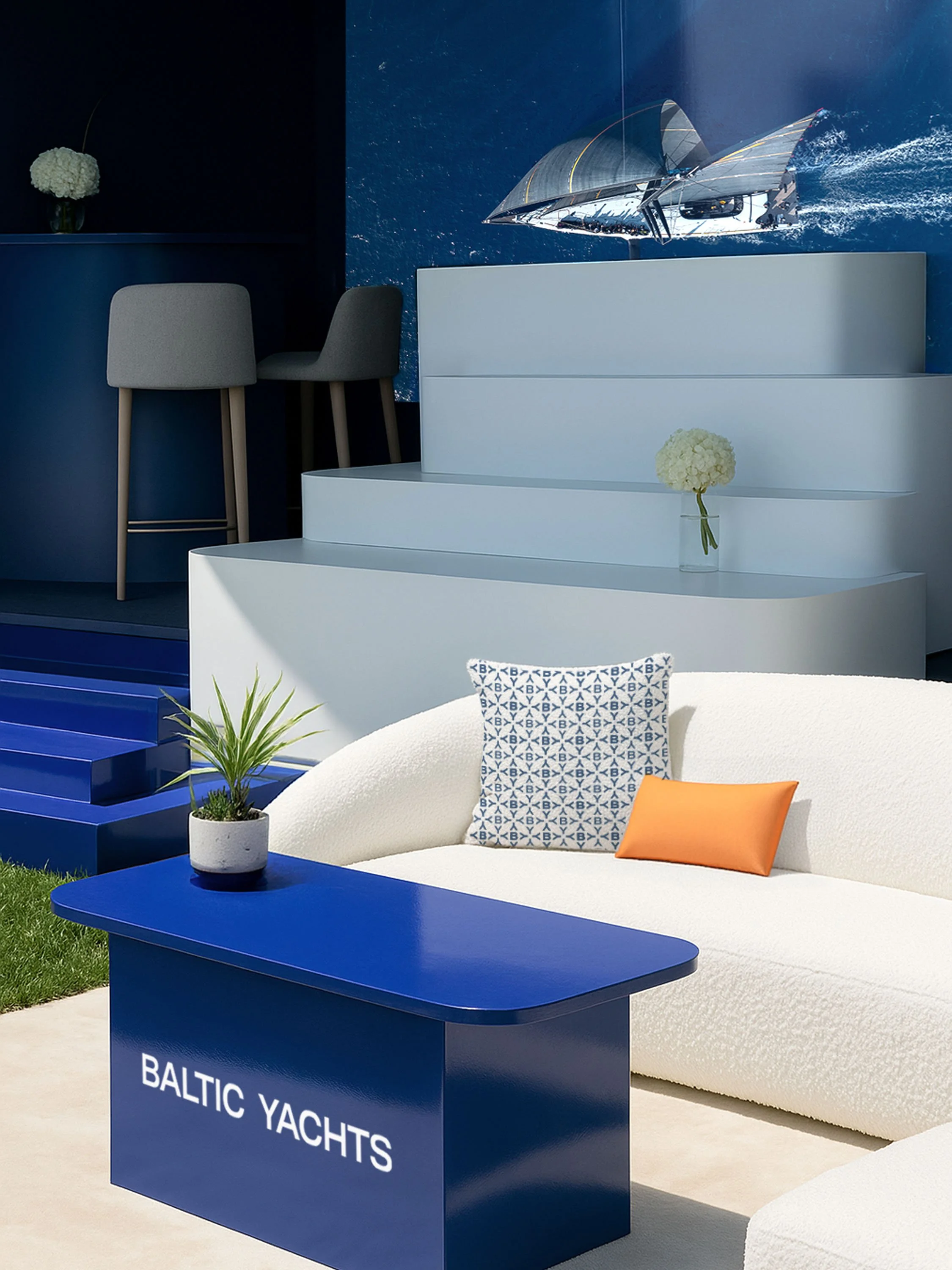

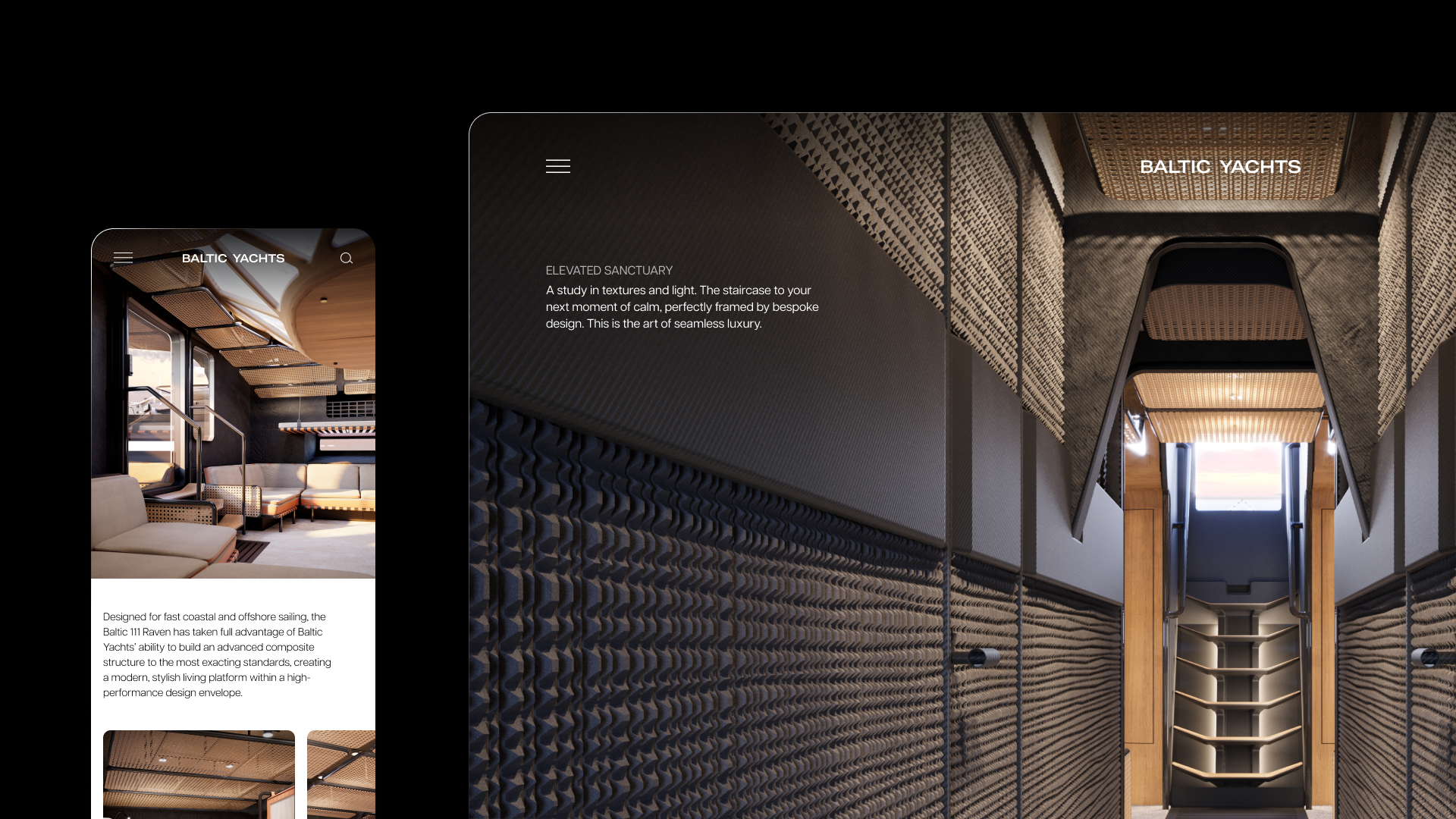
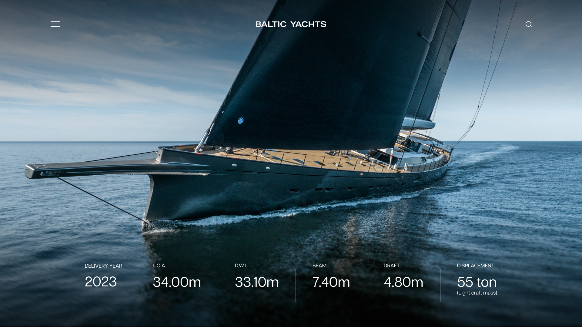
We also designed their new website, yet to launch. After a full UX review and workshops to define the information architecture, wireframes, and content we created a full UI package that truly expressed the brand. Full bleed, bold imagery and video brought the site to life with smooth, mobile-first interactions. We built the site in Wordpress, refined all imagery and wrote the site copy.

See more of our work
Y.CO Y/12
Camper & Nicholsons

Sea&I SS25