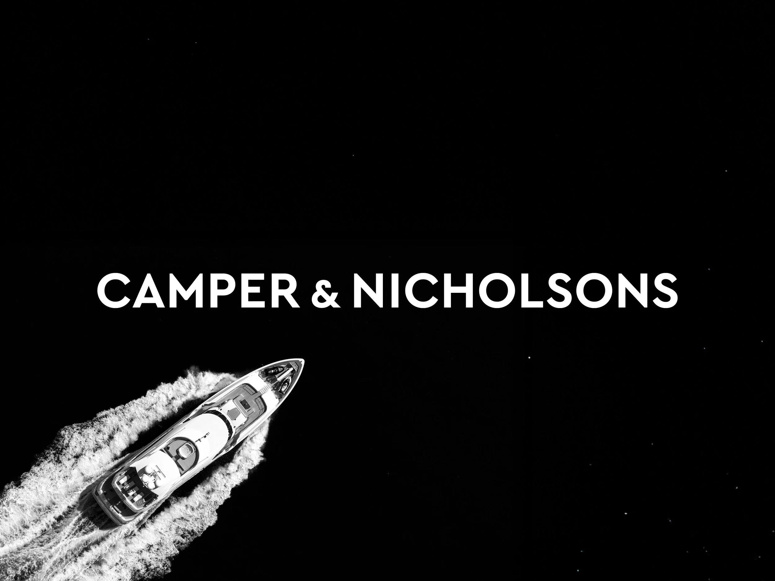
CAMPER & NICHOLSONS
Rebranding the original yachting company
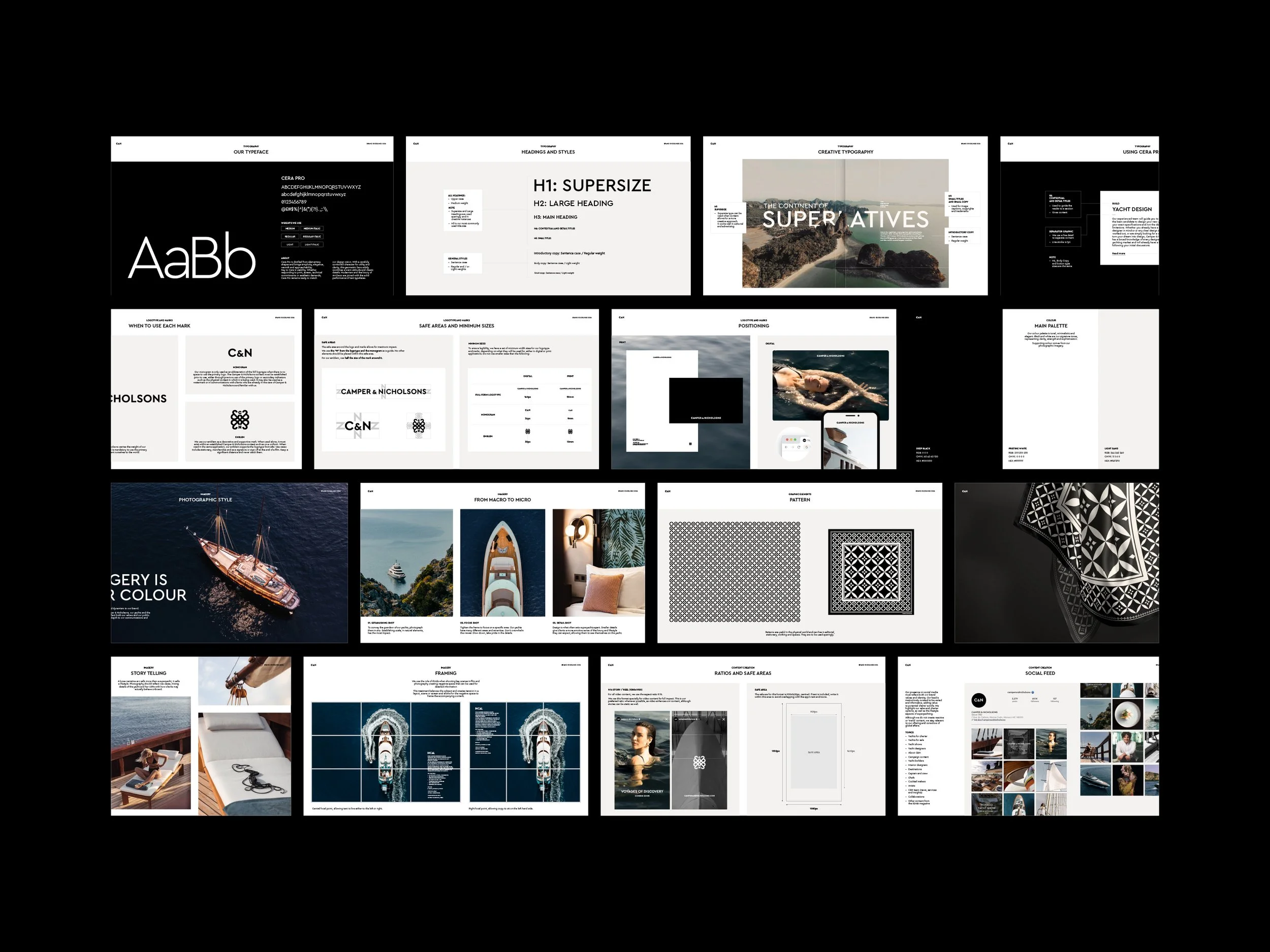
Camper & Nicholsons is a world renowned yachting company, specialising in the sale, purchase, charter, marketing, management and construction of sailing and motor superyachts. Founded in 1782, it has an illustrious history full of innovation and heritage. We paid homage to this in the brand refresh, taking inspiration from the original shipyard sign to create the new logo. Our research phase into the high net worth audience lead us to create a refined brand identity with a muted and simple colour palette. We revised the brand values to reflect their position and ethos, and used this through the creation of all assets from digital through to print.
Our output included…
Brand strategy
Brand identity
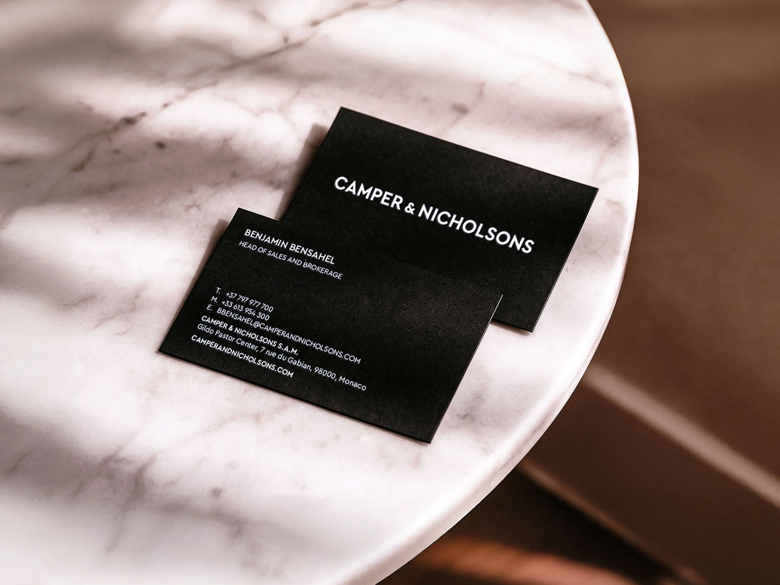
Brand collaterals
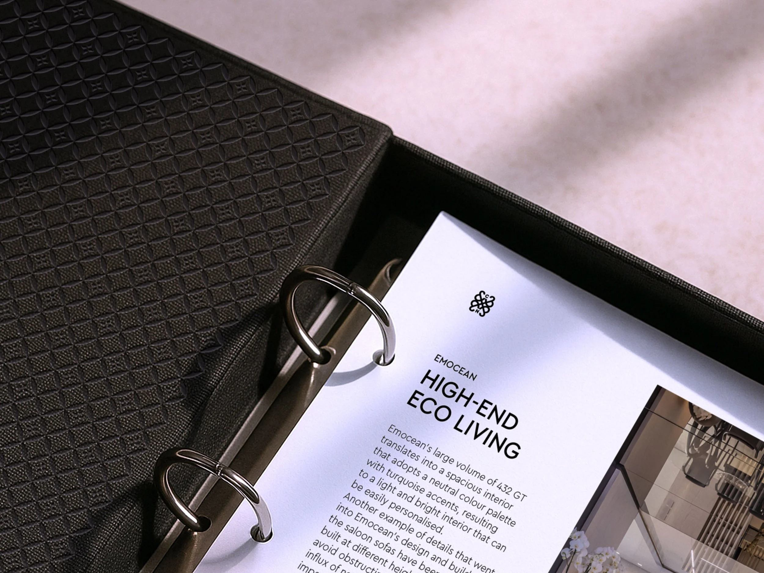
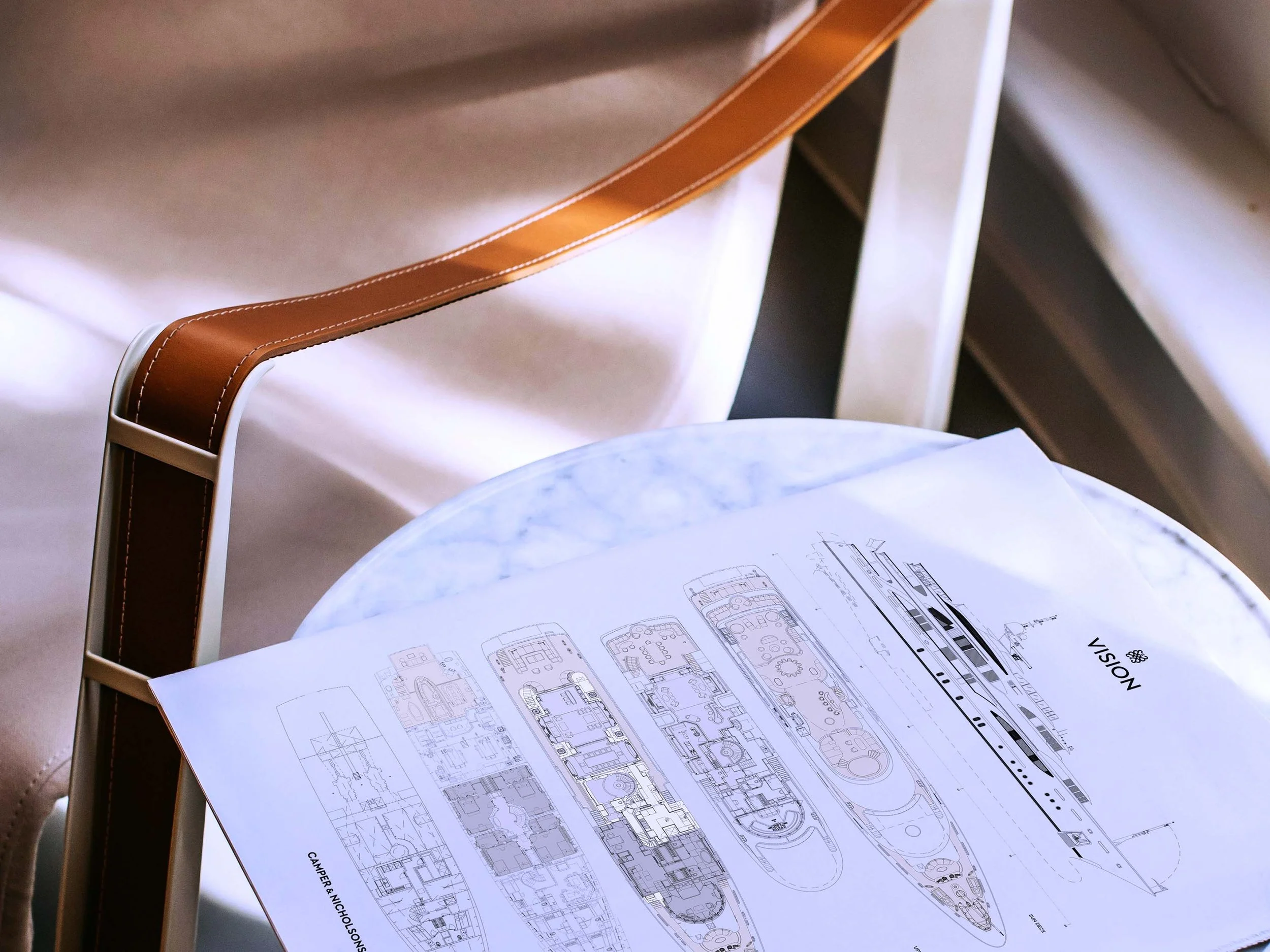
Editorial design
Guidance
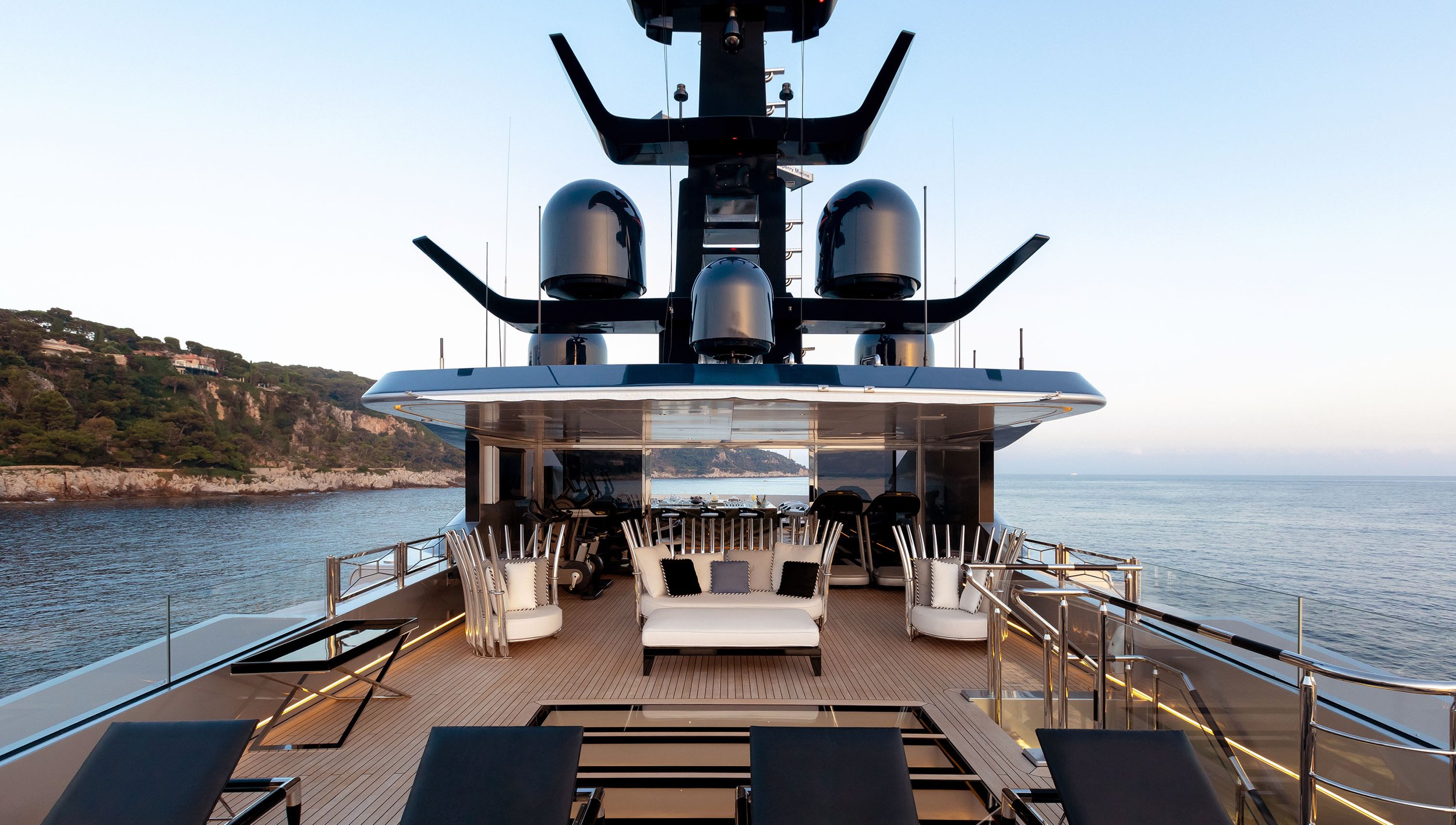
Monaco Yacht Show photography
Tiger Co
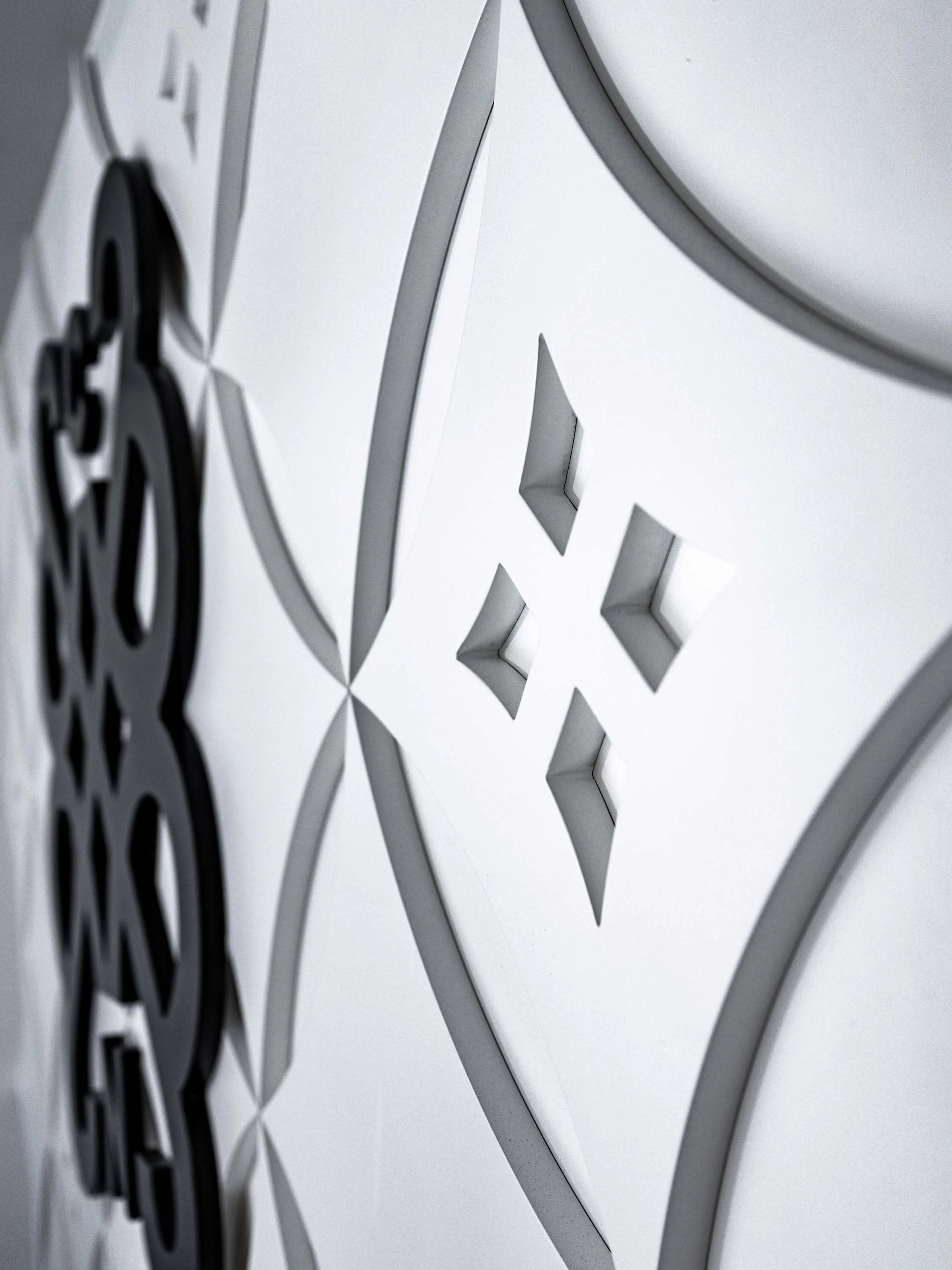
From the logotype, we crafted the emblem.The mark embodies elegance and simplicity while staying true to the Camper & Nicholsons rich past.
It is formed by four ampersands from the full form logotype, which represent the Camper & Nicholsons values: Elegant, Excellence, Pioneering and Connected, and reflects the strong relationships they form both with their clients and across their global family.


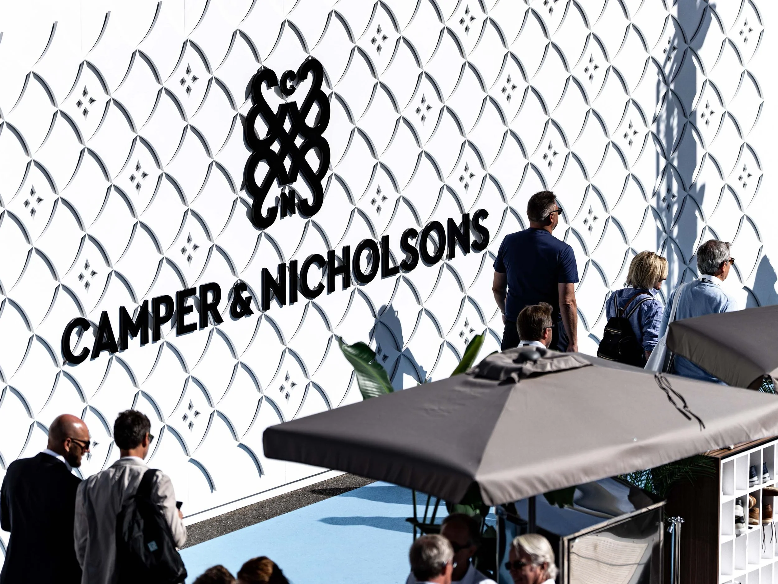
Using the emblem as our foundation, we created the Camper & Nicholsons pattern. A composition born from the emblem’s hidden forms: the compass and the helix.
Together, these shapes embody unity, guidance, direction, and craftsmanship.
The pattern lives within physical spaces such as yacht shows and global offices as well as in flags and bespoke silk scarves.


We re imagined Camper & Nicholsons social presence, creating curated lifestyle campaigns that showcase not only their impressive fleet, but also capturing the essence of contemporary yachting culture—where curated journeys, exceptional service, and understated luxury define every voyage.

See more of our work

Camper & Nicholsons Merchandise
The Run To

Sea&I AW25