
AMY
Amy is a London-based collective of thinkers, writers and creators who explore and celebrate human-centred thinking. As a new research company offering both generalised and bespoke consumer insight for companies ranging from small start-ups to global corporations, Amy asked us to create a brand positioning and identity for them.
Our output included…
Audience research
Copywriting
Brand strategy
Visual identity
Social media guidance
Illustration
Bringing the value of intelligence to life

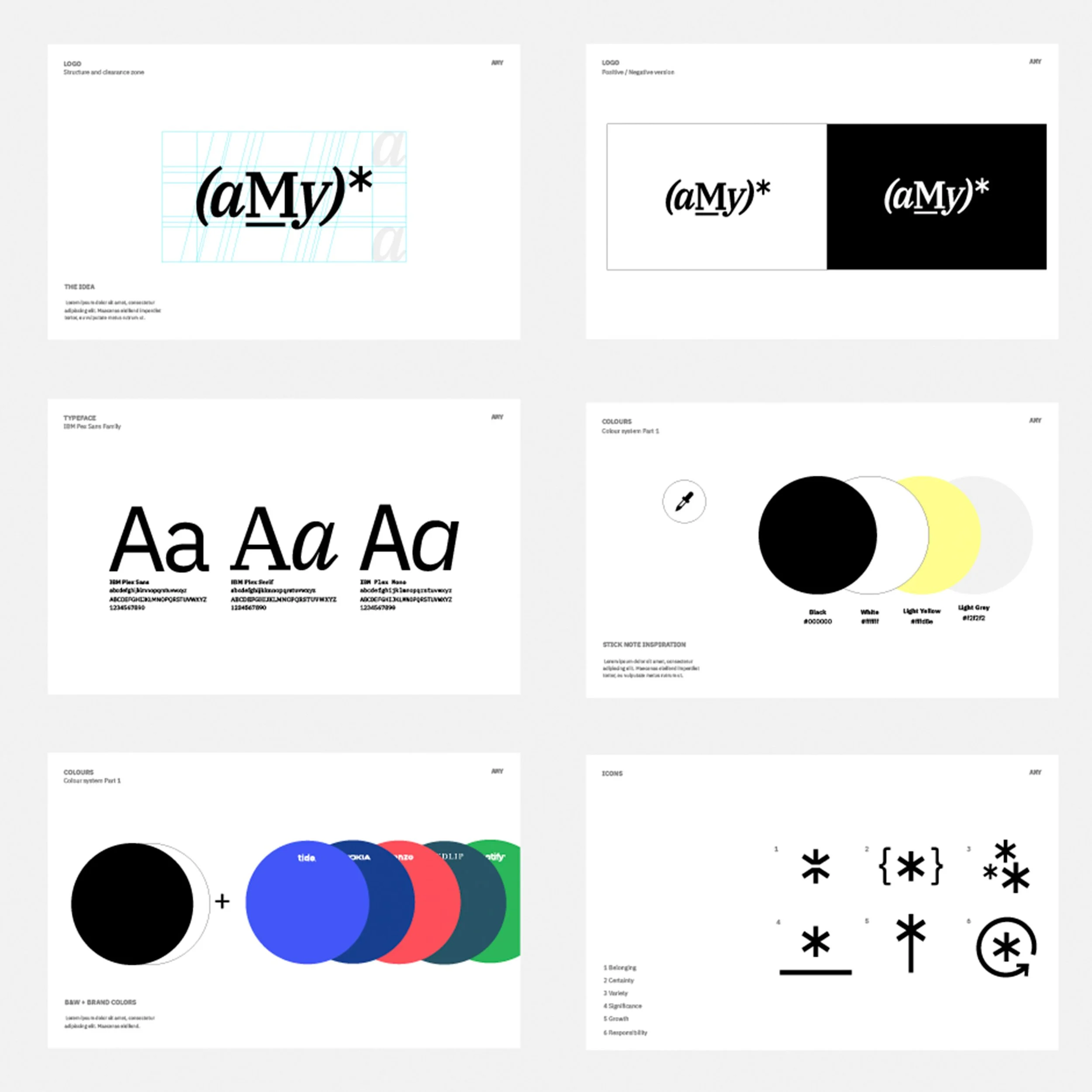
We researched Amy's target audience and explored the media and messaging they are often exposed to. Strategic processes need focus and gathering insight can sometimes feel overwhelming. We were keen to create an identity with clarity and purpose to appropriately support the content and make it easy for viewers to navigate the variation of what Amy has to offer.


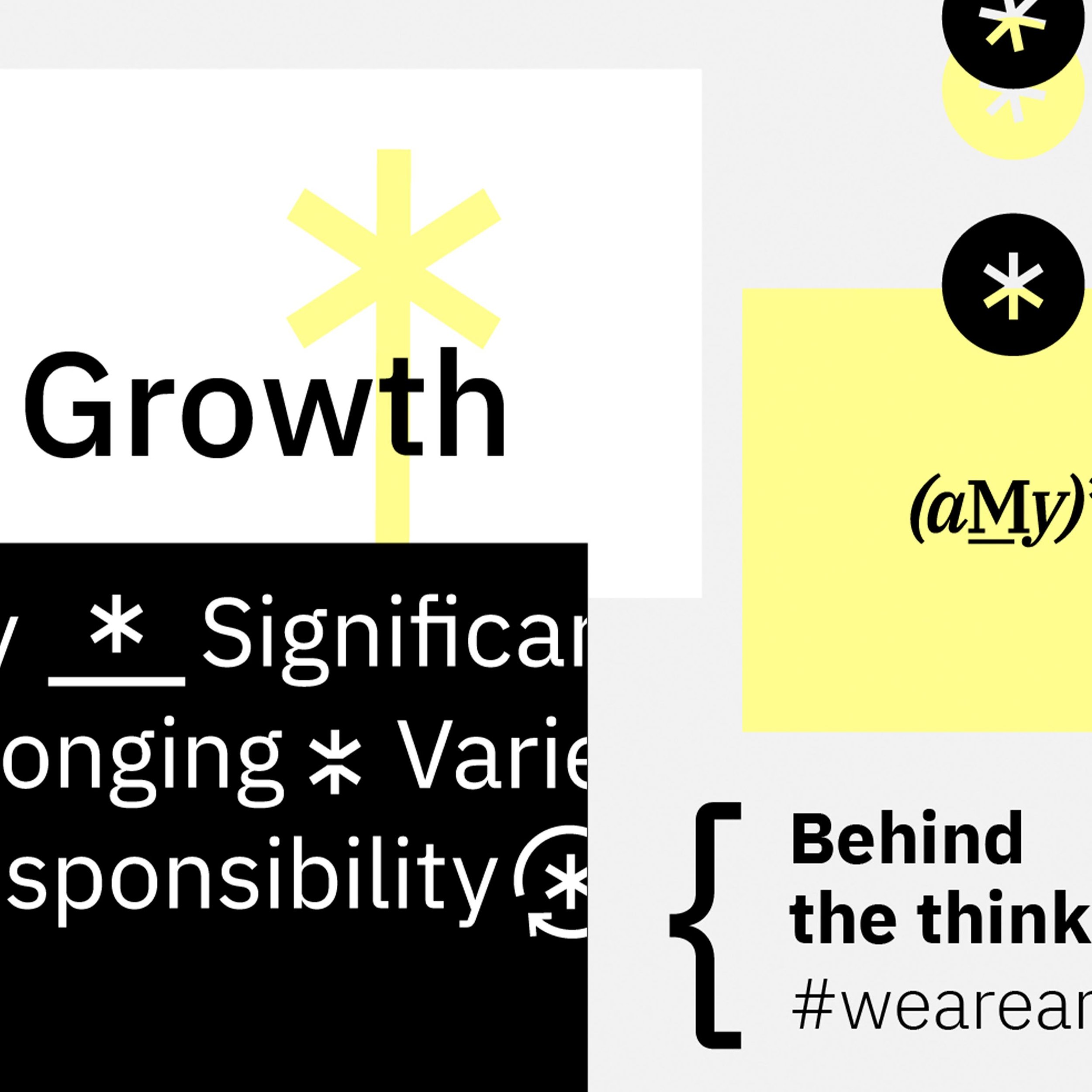
It was important that the logo and identity exist as a living manifestation of the brand’s values and origins. The name Amy is inspired by the part of the brain that processes our emotions: the amygdala. The intersection of science, research, and empathy that drives the company to humanise consumer culture is very fluid, which we aimed to echo. We created a typographic logo that looks both scientific and design-led, creating the asterisk as our logo symbol.
Extrapolating on the asterisk, we developed a set of unique icon illustrations to represent the key emotional drivers that Amy explores: belonging, certainty, variety, significance, growth and responsibility.
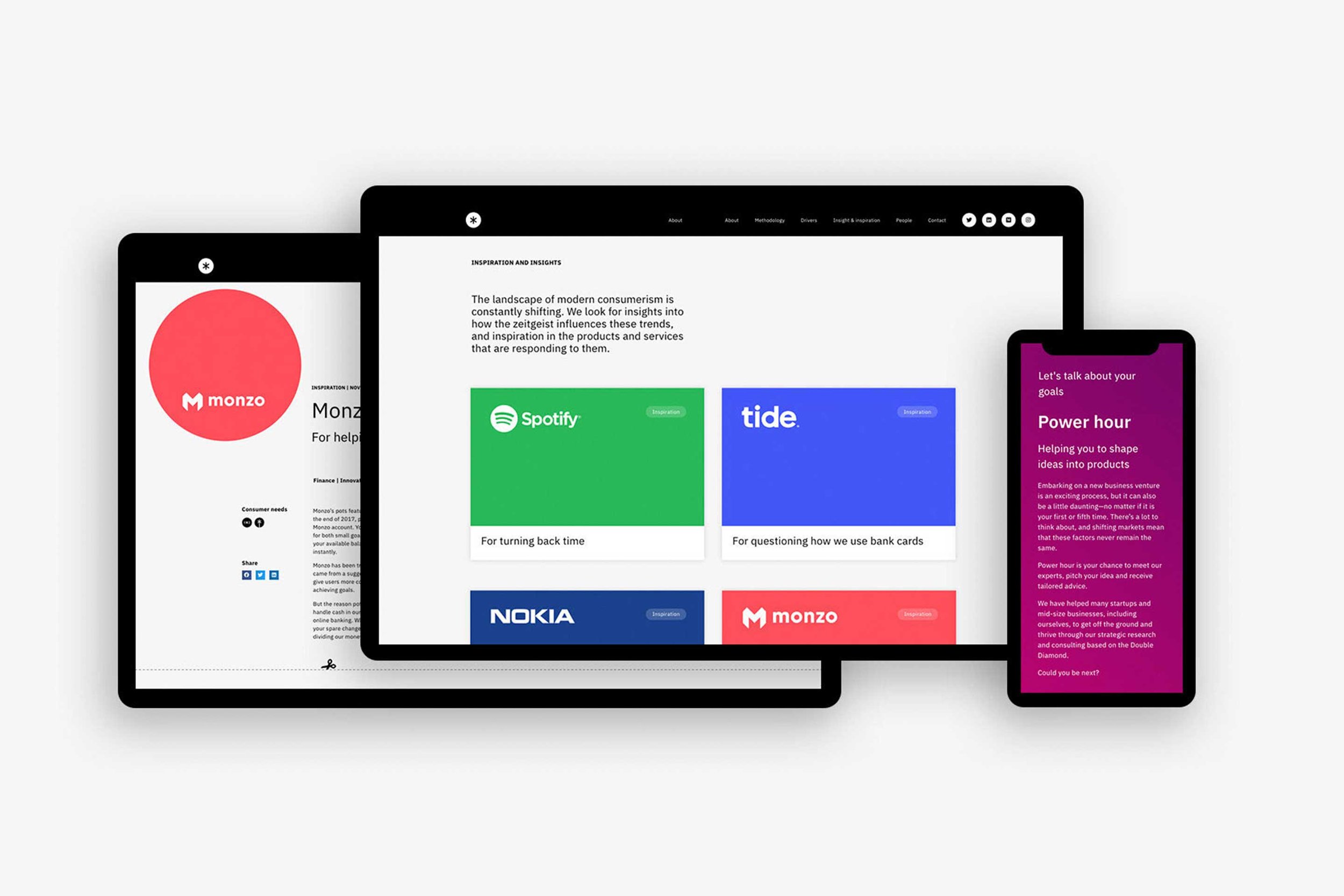
These were applied across the website and social media, as well as being animated, to generate interest in the lead up to the brand’s launch.


Key identity decisions have also been linked to Amy's methodology including the choice of brand colours. The use of yellow and black echos the image of post-it notes and marker pens.
At Why we work alongside Amy as a partner agency, using our shared values to collaborate on innovative and impactful projects.
See more of our work

Sea&I

James Eadie

The Run To