
YO! SUSHI
Creating an edible, shareable brand experience
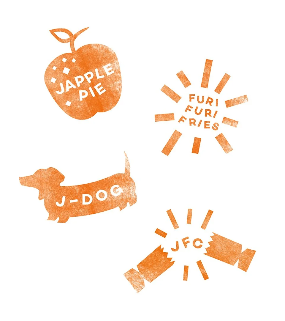
With more than 70 restaurants, Yo! Sushi is one of the largest sushi brands outside Japan. We were asked us to help launch 12 new dishes over the course of a year, each with an unusual twist on street food. The brief was simple: sell the idea that you only live once. Each dish was available for a limited time, so the launches needed to impress and encourage people to try something new. From the J-Dog to Japple Pie, the result was something fun, fast and original.
Our output included…
Experience strategy
Visual identity
Copywriting
Art direction
Social media guidance
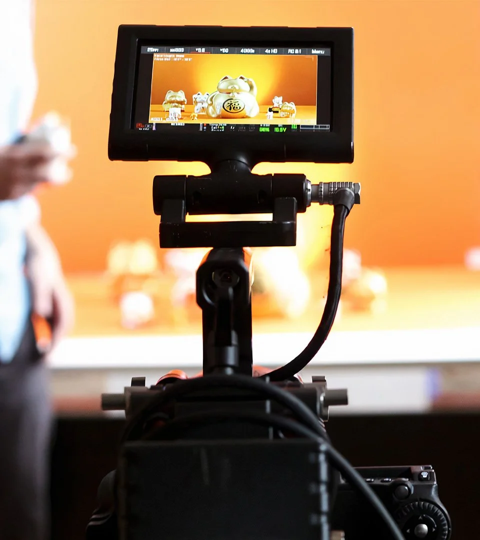
Photography
Media production

We created a high-energy concept to launch YOLO and came up with the idea of developing shareable experiences around each dish. We turned YOLO into the #yoment. Treating each monthly launch as a moment in time gave us the opportunity to engage by inspiring people to share their favourite #yoments across social media. In addition to the main identity, every dish was given its own identity, including temporary tattoos for the staff and customers to apply.

We worked closely with Yo! Sushi’s executive chef to translate his bold ideas into equally bold assets. Each dish was designed to be fun, interactive and eaten with your hands, whether it was injecting an apple pie and ice cream cone with a syringe of caramel, or squirting a keyring-sized bottle of Sriracha hot sauce on a Japanese-style hot dog. Using playful design and art direction, we let the novelty of the food lead our approach.


Our aim was to create a unique feeling that was still very much part of Yo! Sushi’s identity. The campaign lines ‘Seize the dish’ and ‘Now or never’ were applied to literature, and the #yoment concept was used for window graphics, customisable T-shirts and point-of-sale to reinforce the social element. The identities for each dish used simple graphics designed to translate easily as stamps and temporary tattoos.


See more of our work

Sea&I

James Eadie

The Run To